


Know Your Customer: Designing for a Moment of Intent
Most websites don’t fail because the product is bad.
They fail because the site is speaking to the wrong person at the wrong moment in the wrong way.
That usually traces back to one foundational issue:
The business doesn’t truly understand who the site is for at that moment of arrival.
Companies say they “know their customer.” They can list demographics, job titles, industries, and company sizes. But knowing a customer on paper and designing for a customer in motion are two very different things.
Websites are not brand brochures. They are decision environments. And decisions are driven by intent, context, and emotion—not personas stored in a slide deck.
If your website isn’t converting, chances are it’s not because visitors don’t care. It’s because the site doesn’t clearly answer the questions they’re silently asking.
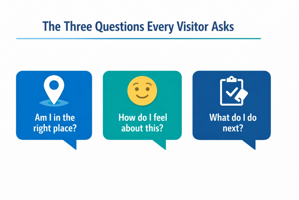
The Three Questions Every Visitor Asks (Whether You Answer Them or Not)
Every visitor—consciously or not—asks the same three questions within seconds of landing on your site:
- Am I in the right place?
- How do I feel about this site and this company?
- What am I supposed to do next?
If the answer to any of these is unclear, friction appears. And friction kills momentum.
This is where “knowing your customer” becomes practical instead of theoretical.
The best-performing websites don’t try to explain everything.
They reassure the right person immediately.
Why “Everyone” Is the Most Expensive Audience You Can Target
One of the most common (and costly) mistakes businesses make is designing for the broadest possible audience.
The logic sounds reasonable:
“We don’t want to exclude anyone.”
But on the web, inclusivity through vagueness doesn’t feel welcoming—it feels confusing.
When messaging is generic, visitors have to do extra work to figure out:
- Whether the solution applies to them
- Whether their problem is understood
- Whether the business is credible in their situation
That extra work is where people drop off.
High-converting websites are selective—not arrogant, but focused. They clearly signal:
- Who this is for
- What problem it solves
- Why it matters now
Ironically, specificity increases conversions without shrinking the audience. When people recognize themselves in the message, they lean in—even if they’re slightly outside the “ideal” profile.
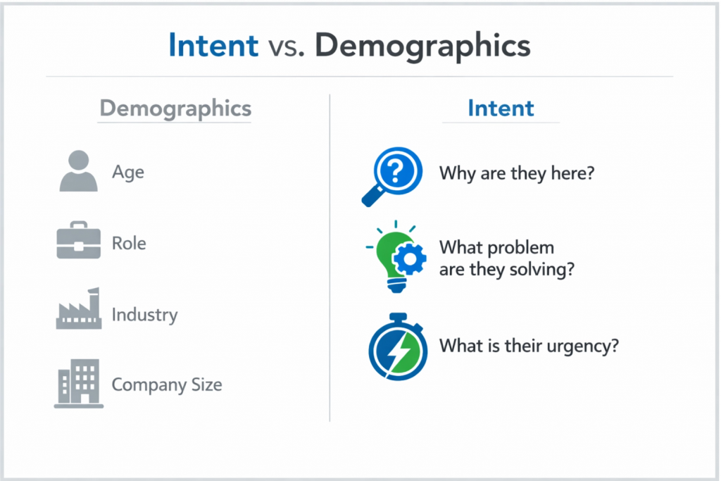
Intent Beats Demographics Every Time
Traditional personas emphasize static attributes:
- Age
- Role
- Industry
- Company size
Intent-based design focuses on something far more powerful:
- Why is this person here today?
Someone visiting your site could be:
- Researching options
- Comparing vendors
- Looking for reassurance
- Trying to justify a decision already made
- Solving a problem under time pressure
Two visitors with identical job titles may need entirely different experiences based on where they are in the decision process.
Great websites don’t just ask, “Who is this person?”
They ask, “What problem are they trying to solve right now?”
The Hidden Cost of Misaligned Messaging
When a site doesn’t align with visitor intent, several things happen:
- Bounce rates increase
- Engagement drops
- Leads become lower quality
- Sales conversations start with confusion instead of momentum
Sales teams feel this first. They hear:
- “I wasn’t sure if you handled this.”
- “I thought your service was something else.”
- “I didn’t realize you were focused on companies like ours.”
Those aren’t sales objections.
They’re clarity failures upstream.
Marketing brought people in.
The website failed to orient them.
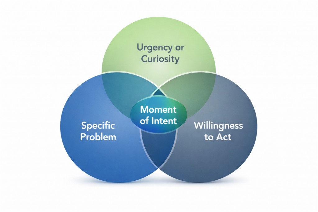
Designing for a Moment of Intent
A “moment of intent” is the intersection of:
- A specific problem
- A sense of urgency or curiosity
- A willingness to act if the right solution appears
Your website should be optimized for that moment—not for internal explanations, feature lists, or company history.
This means prioritizing:
- Clear positioning over clever messaging
- Customer language over internal terminology
- Outcomes over features
The goal is not to educate immediately.
The goal is to confirm relevance.
The Homepage Test: One Line That Does All the Work
This brings us to the core action item:
Look at your homepage headline. If a prospect read only that line, would they clearly know who the site is for and why it matters to them?
Most headlines fail this test.
Common problems include:
- Being too clever
- Being too vague
- Being aspirational instead of practical
- Describing the company instead of the customer
A strong headline doesn’t try to impress.
It tries to orient.
It answers, in plain language:
- Who this helps
- What it helps with
- Why that matters now
If visitors have to scroll to understand relevance, you’re already behind.
Customer Language vs. Company Language
One of the fastest ways to improve relevance is replacing company-centric language with customer-centric language.
Company language sounds like:
- “Our comprehensive platform”
- “Innovative solutions”
- “Industry-leading technology”
Customer language sounds like:
- “Reduce wasted ad spend”
- “Convert more qualified leads”
- “Make decisions with confidence”
Customers don’t wake up wanting platforms or solutions.
They wake up wanting fewer problems.
Your job is to reflect their internal monologue—not your org chart.
Emotion Comes Before Logic
Even in B2B, decisions are emotional first and rational second.
Visitors want to feel:
- Understood
- Safe
- Confident
- In control
If your site jumps straight to logic—features, specs, processes—without first addressing emotional concerns, it creates resistance.
That resistance shows up as:
- “I’ll think about it”
- “Send me more information”
- “Let me check internally”
Emotion doesn’t mean hype.
It means empathy.
How to Operationalize “Know Your Customer”
This isn’t about rewriting everything at once. It’s about sharpening focus.
Start by answering these questions honestly:
- What problem brings our best customers to us?
- What were they worried about before choosing us?
- What almost stopped them from moving forward?
- What outcome mattered most to them?
Then pressure-test your website against those answers.
Does the homepage reflect them?
Do key pages reinforce them?
Do calls-to-action align with that mindset?
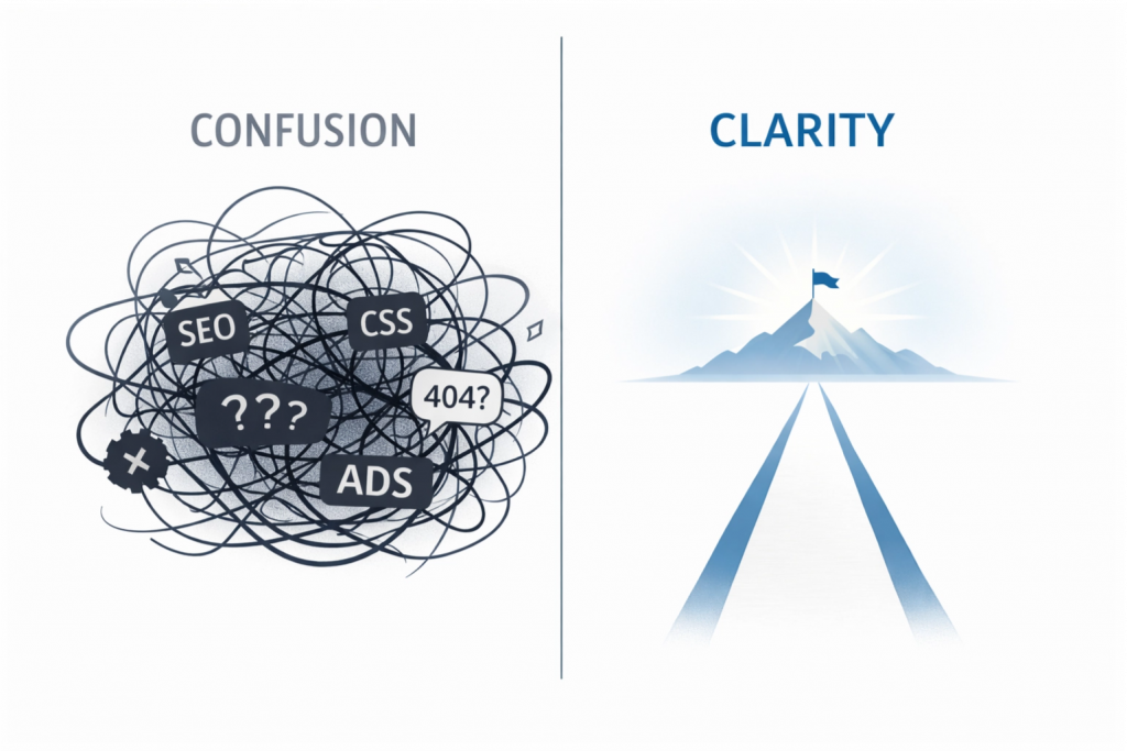
Final Thought: Clarity Is a Competitive Advantage
In crowded markets, clarity wins.
When visitors instantly recognize:
- “This is for me”
- “They understand my situation”
- “This feels easier than the alternatives”
Conversions follow naturally.
You don’t need louder messaging.
You need clearer messaging—for the right person, at the right moment.
This week, rewrite your homepage headline using only customer language.
No buzzwords.
No internal jargon.
No clever metaphors.
Just a clear answer to:
- Who this is for
- What problem it solves
- Why it matters
Then watch what happens to engagement and conversations downstream.