


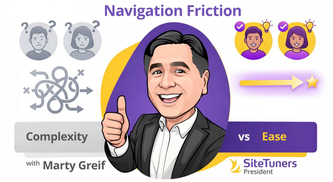
Ease and Humanity: Designing Navigation That Respects the Visitor
Most websites don’t lose customers because the product is wrong.
They lose customers because the experience is tiring.
Navigation is one of the most underestimated conversion factors on a website. It rarely shows up on wish lists or feature roadmaps. But it quietly determines whether visitors feel capable or incompetent, calm or frustrated, confident or lost.
When navigation works, no one notices.
When it fails, everything else fails with it.
Ease and humanity in navigation isn’t about clever design patterns or trendy menus. It’s about one simple idea:
Don’t make visitors work harder than they need to.
Websites are not puzzles. They’re tools. And tools should feel intuitive the moment you pick them up.
Friction Is the Silent Conversion Killer
Every visitor arrives with a limited amount of mental energy. They’re already juggling decisions, distractions, and uncertainty. Your website either reduces that load—or adds to it.
Friction shows up when visitors have to:
- Guess where information might live
- Decode unfamiliar labels
- Remember what they clicked two pages ago
- Backtrack repeatedly
- Reorient themselves after every interaction
Each of these moments chips away at trust and momentum.
Conversion problems are often diagnosed as messaging issues or traffic issues. But very often, the real issue is navigational fatigue.
Visitors don’t leave because they dislike you.
They leave because the experience feels harder than it should.
Humanity Begins with Predictability
Human-centered navigation respects expectations.
Visitors bring mental models with them—shaped by thousands of other websites they’ve used. When your site aligns with those expectations, it feels easy. When it violates them unnecessarily, it feels hostile.
Examples of predictable, human navigation:
- Clear, descriptive menu labels
- Logical grouping of related items
- Familiar placement of navigation elements
- Consistent behavior across pages
Examples of anti-human navigation:
- Clever labels that prioritize branding over clarity
- Hidden menus with no clear benefit
- Too many choices at once
- Navigation that changes unpredictably between pages
Creativity has a place. Navigation usually isn’t it.
The goal isn’t to impress visitors with originality.
The goal is to help them move forward without friction.
“Don’t Make Me Think” Is Still the Rule
One of the most enduring usability principles is also one of the simplest:
If a visitor has to stop and think about how to use your site, something is wrong.
Thinking introduces doubt.
Doubt slows action.
This doesn’t mean your site has to be boring. It means clarity must win every tie-breaker.
Ask yourself:
- Can someone understand what each menu item leads to without clicking it?
- Is it obvious where to go next on every page?
- Can users easily tell where they are within the site?
If the answer to any of those is “maybe,” friction is already present.
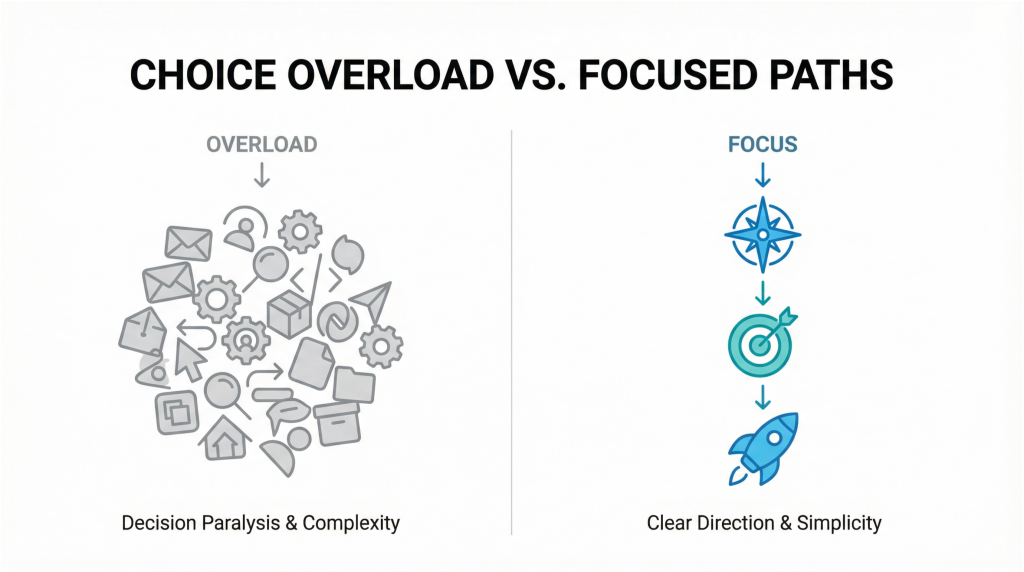
Choice Overload Is Not a Feature
Many sites try to be helpful by offering everything at once.
The result is usually the opposite.
Large, crowded menus force visitors to scan, compare, and decide before they even understand the context. That’s not helpful; it’s exhausting.
Human navigation prioritizes:
- Fewer, clearer choices
- Progressive disclosure (revealing complexity only when needed)
- Emphasis on the most common paths
Visitors don’t want all options immediately.
They want the right option at the right moment.
When in doubt, simplify.
Navigation Should Answer a Question, Not Ask One
Every click should feel like a confident step forward, not a gamble.
Poor navigation asks visitors questions:
- “Is this where I’ll find what I need?”
- “Will this take me somewhere useful?”
- “What happens if I click this?”
Great navigation answers those questions before they’re asked.
That means:
- Using plain language instead of internal jargon
- Avoiding ambiguous labels
- Designing links that set clear expectations
Clarity builds trust.
Trust builds momentum.
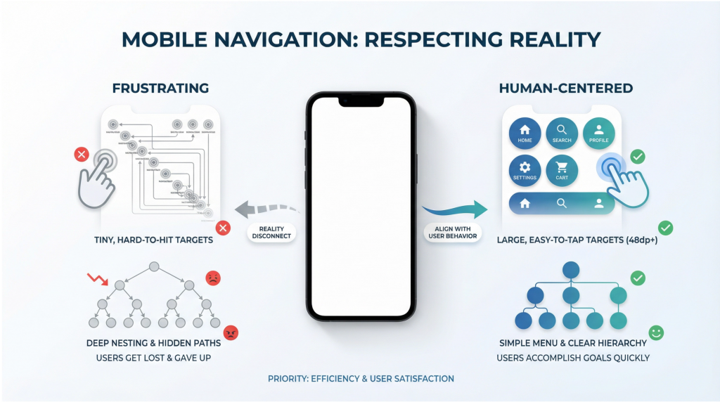
Mobile Navigation Is Where Humanity Is Tested
If navigation feels frustrating on desktop, it feels punishing on mobile.
Small screens magnify every problem:
- Overloaded menus
- Tiny tap targets
- Deep nesting
- Inconsistent behavior
Human-centered mobile navigation respects physical reality:
- Thumbs, not mice
- One-handed use
- Interruptions and distractions
- Limited attention
Ask:
- Can someone reach key navigation elements comfortably?
- Are the most important actions easy to access?
- Does the menu feel simple or overwhelming?
If mobile users struggle, conversions suffer—even if desktop metrics look fine.
Orientation Is an Act of Empathy
Visitors should never feel lost.
Human navigation constantly answers:
- “Where am I?”
- “How did I get here?”
- “What can I do next?”
This can be reinforced through:
- Clear page titles
- Logical URL structures
- Visual hierarchy
- Breadcrumbs where appropriate
- Consistent calls-to-action
Disorientation creates anxiety.
Anxiety kills confidence.
Orientation restores a sense of control—and control increases the likelihood of action.
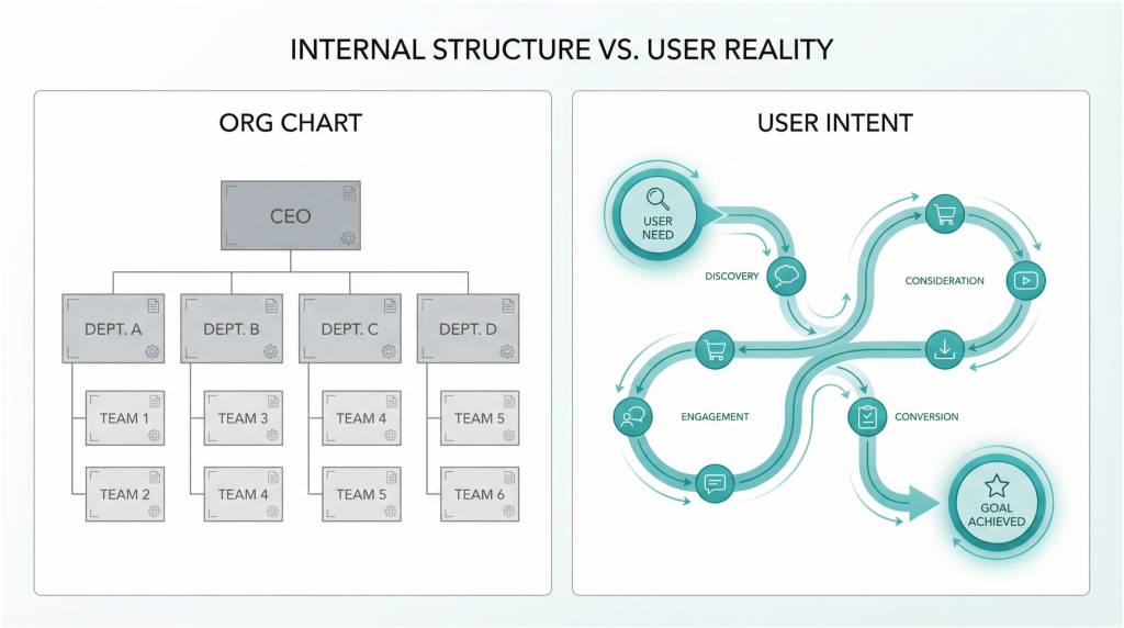
Internal Structure vs. External Reality
One of the biggest navigation mistakes happens behind the scenes.
Websites are often organized based on:
- Internal departments
- Product lines
- Company org charts
- Internal terminology
Visitors don’t care about any of that.
They care about:
- Their problem
- Their goal
- Their next step
Human navigation is structured around user intent, not internal convenience.
If visitors have to learn how your company is organized just to use your site, the site has failed them.
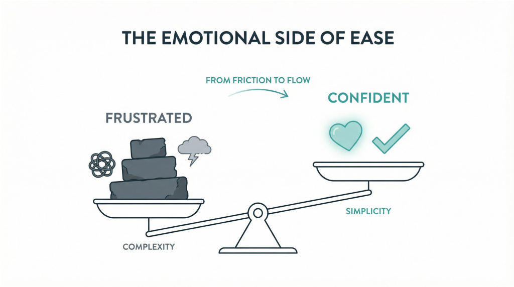
The Emotional Side of Ease
Ease isn’t just functional. It’s emotional.
When a site is easy to navigate, visitors feel:
- Capable
- Respected
- Calm
- Confident
When it’s hard, they feel:
- Frustrated
- Rushed
- Incompetent
- Skeptical
Those emotions carry into sales conversations, lead quality, and brand perception.
Ease signals maturity.
Ease signals competence.
Ease signals trustworthiness.
How to Evaluate Your Navigation Honestly
You don’t need advanced tools to find navigation problems. You need honesty.
Start with these questions:
- Can a first-time visitor find the most important content in under 10 seconds?
- Are there menu items that exist “just in case”?
- Do users frequently rely on search because navigation isn’t clear?
- Are key pages buried too deeply?
Then observe real behavior:
- Watch session recordings
- Review heat maps
- Listen to sales calls
- Ask new customers what confused them
The answers are usually obvious once you look.
Final Thought: Ease Is a Competitive Advantage
In markets where products are similar and messaging sounds the same, ease wins.
The website that feels simpler, calmer, and more human becomes the default choice even if competitors have more features or louder claims.
You don’t need more content.
You don’t need more options.
You don’t need more cleverness.
You need a site that respects the visitor’s time, attention, and mental energy.
That’s what humanity in navigation looks like.
Action Item
This week, audit your primary navigation with one rule:
If a visitor has to think about where to click, simplify it.
Rename one unclear label.
Remove one unnecessary option.
Surface one important path more clearly. Small changes in ease create outsized gains in conversions—because they remove friction where it matters most.