


Optimal Mobile Layout: Designing for Real Life, Not Desktops
Mobile traffic didn’t “arrive.”
It quietly became the default.
Yet many websites still treat mobile as a scaled-down version of desktop. The result is technically responsive layouts that are emotionally frustrating.
Mobile users aren’t sitting at desks.
They’re in lines, on couches, between meetings, and half-distracted.
Optimal mobile layout respects reality.
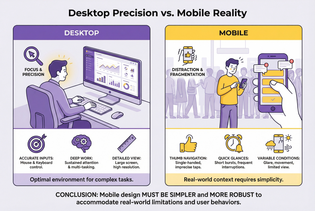
Mobile Changes Everything
On desktop, visitors:
- Have more screen space
- Have better precision
- Are often more focused
On mobile, visitors:
- Use thumbs, not cursors
- Navigate with one hand
- Deal with constant interruptions
Designing mobile experiences requires more than rearranging elements. It requires rethinking priorities.
Above the Fold Is Smaller on Mobile
On desktop, “above the fold” can hold multiple messages, images, and CTAs.
On mobile, it’s tiny.
That space must answer three things immediately:
- What this is
- Why it matters
- What to do next
If visitors scroll before understanding relevance, friction appears fast.
Clarity must come first. Everything else earns its place.
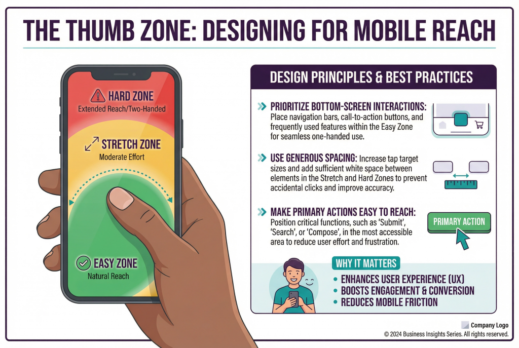
Thumb Reach Is a Conversion Factor
Ease of use on mobile is physical.
Elements placed too high, too small, or too close together create frustration.
Optimal mobile layouts:
- Prioritize bottom-screen interactions
- Use generous spacing
- Make primary actions easy to reach
If visitors need two hands to navigate, something is wrong.
Fewer Elements, Stronger Impact
Mobile screens amplify clutter.
What feels manageable on desktop becomes overwhelming on a phone.
Human-centered mobile design:
- Removes non-essential content
- Breaks information into digestible sections
- Focuses on one action at a time
Mobile is not the place for competing messages.
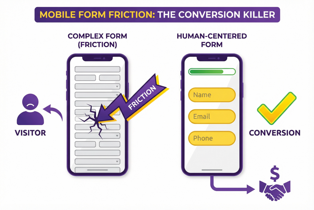
Forms Must Be Ruthlessly Simple
Forms are already effort. On mobile, they’re exhausting.
Common mobile form mistakes:
- Too many fields
- Poor keyboard selection
- Tiny input areas
- No progress indication
Optimal mobile forms:
- Ask only what’s necessary
- Use the correct keyboard types
- Provide visual breathing room
- Feel short even when they aren’t
Every extra field feels heavier on mobile.
Speed Is Not a Nice-to-Have
Mobile users feel delays more acutely.
Even small performance issues feel amplified:
- Heavy images
- Auto-playing media
- Excessive scripts
Speed influences perception.
Slow sites feel unreliable.
Fast sites feel competent.
Performance is part of layout.
Navigation Must Be Obvious and Forgiving
Hidden navigation, clever gestures, and tiny menus frustrate mobile users.
Good mobile navigation:
- Is easy to find
- Is easy to tap
- Is easy to exit
Visitors shouldn’t fear getting stuck.
Orientation and escape are acts of empathy.
Interruptions Hurt More on Mobile
Pop-ups that cover the screen.
Sticky elements that steal space.
Banners that won’t close easily.
What’s mildly annoying on desktop can be unbearable on mobile.
Mobile layouts must be even more respectful.
Visual Hierarchy Is Non-Negotiable
On mobile, visitors scan vertically.
Strong hierarchy:
- Guides the eye
- Reduces cognitive load
- Creates rhythm
Weak hierarchy forces effort.
If everything looks important, nothing is.
Mobile Is Often the First Impression
For many visitors, mobile is not a secondary experience. It’s the introduction.
A frustrating mobile layout damages trust instantly.
Visitors won’t “check desktop later.”
They’ll leave.
How to Audit Mobile Layout Honestly
Forget simulators.
Use your phone.
- Try to complete key actions quickly
- Use your site in poor lighting
- Navigate with one hand
- Interrupt yourself mid-task
If it feels hard, it is.
Final Thought: Mobile Layout Is About Respect
Optimal mobile layout doesn’t impress designers.
It respects users.
It removes friction.
It simplifies decisions.
It adapts to real life.
When mobile feels easy, conversion follows naturally.
Action Item
Choose one high-impact page.
Remove one element that isn’t essential on mobile.
Increase spacing around one key action.
Then measure engagement. On mobile, small layout improvements often produce large conversion gains because they reduce frustration at the exact moment visitors are deciding whether to continue.