


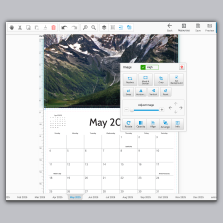


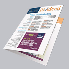


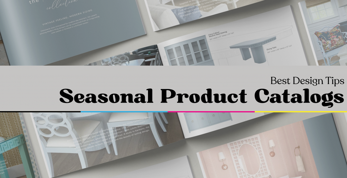
Best Design Tips for Seasonal Product Catalogs
Seasonal products and the marketing that supports them are vital to driving traffic and sales during peak times of the year. Each season brings a new chance to inspire your customers. Seasonal catalog design plays a major role in that. It’s how you reintroduce your brand, highlight what’s new, and connect your products to what’s happening in the world right now.
Stay Relevant
Your customers might not always know exactly what they want, but they know what’s trending. Meet them where their attention already is. Connect your products to what’s popular, whether that’s a song, a holiday or the mood of the moment like “brat summer.”
The most important thing to know is that: seasonal marketing gives your audience something to feel and that emotional connect is what keeps your brand relevant and memorable. Don’t sit out the season. Your seasonal catalog design should reflect what people are talking about, loving, and buying right now, and your brand will stay top of mind all year long.
Every design choice: color, layout, photography, shapes how people feel about your products and ultimately influences their decision to buy.

Plan
Before you design a single page, decide what the season feels like and what that looks like for your brand. Your catalog should feel like what your customers are living in, not just the one on the calendar. From there, that should guide the imagery, colors, and copy tone.
You have to be intentional about it. Adding seasonal clip art and surface level themes aren’t going to cut it anymore, especially when we are in a content overload with AI-generated everything. People can tell when design feels generic. What stands out now is work that is curated, thoughtful, and human.
Once you sit down and know the feeling you’re chasing, everything in the catalog should reflect that-colors, imagery, and copy.
Design for Scanability
Most people don’t read catalogs, they scan them. So, the goal is to make every page easy to understand at a glance.
- Use large headlines, overpowering visuals, then smaller supporting copy
- Contrast calls-to-action (buy now, shop set, view online) with a color or shape to make them stand out
- Add small boxes that say “New this Season” or “Limited Edition” These are like mini decision elements. ”
- Add small cue that will subtly guide people’s eyes (icons, arrows)
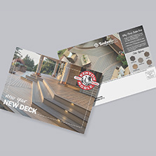
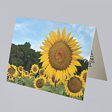
Seasonal Elements
Use seasonal elements that don’t feel cliche. In great seasonal catalog design, subtlety goes further than decoration.
- For Fall: Soft shadows, amber lighting
- For Summer: Lens flare, light gradients, sun
- For Winter: Muted Fog, frost patterns,
- For Spring: watercolor washes, soft focuses
Don’t forget to add subtle textures & semi-transparent overlays to draw focus without heavy decoration. It’s small touches like these that help elevate the design that feels believable, not forced.

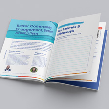
Product Flow & Hierarchy
How your products are arranged matters just as much as how they look. The flow can make or break a catalog.
Start with a strong opener, something that instantly feels like the season. Lead with a hero product or your best story. Those opening pages should grab attention fast and communicate your vibe in seconds.
From there, keep things intentional. Group products by purpose or energy. Think “Cozy Night In,” “Gift Ideas Under $25,” or “Fresh Start Staples.” When people can connect with a feeling or scenario, they understand where your products fit in their lives.
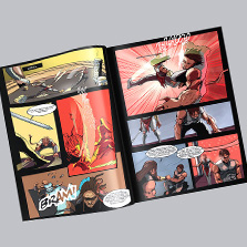
Use hierarchy to your advantage. The eye goes to what’s biggest, brightest, and boldest. So give your bestsellers or seasonal highlights the most visual weight. Supporting products should complement, not compete. White space, contrast, and scale tell the reader what matters most without saying a word.
And end strong. The last few pages are where smaller items or bundles work the best. These are the things people didn’t know they needed until they saw them. Think of it like your closer moment: leave them inspired, not overloaded.
Conversion Design
Good design gets attention, great design gets actions.
Your catalog shows your products but ultimately it’s there for sales & brand awareness. Every page needs to guide people what to do next, even if its subtle. Think: shop the set, scan to order, limited run, back in stock, etc. These phrases are short and instantly create urgency without shouting “BUY NOW.” Make your CTA’s impossible to miss but don’t overdo it. The goal is to blend direction into design so naturally that it feels helpful, not forced.
Think about how people shop, too. If your catalog connects to your website, use QR codes or short links. No one’s typing a mile-long URL. If it’s print-only, give them a clear next step: call, visit, or mention a promo code.
And remember, not every CTA has to be about the sale. You can prompt engagement instead: Share your setup. Tag us. Get inspired. Those touches build connection and ultimately lead to customer retention.
The bottom line? Every visual should lead somewhere. Design like you’re guiding someone through a story and make sure they know how to keep it going once they close the catalog.
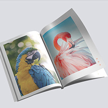
You’re Ready for Print…Now what?
Your design is done, now you’re ready for print. This is where your catalog goes from concept to something customers can hold, flip through, and connect with.
Every production choice directly affects how your design looks, feels, and holds up once it’s printed.
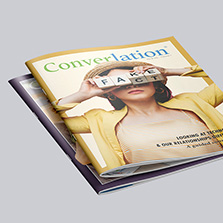
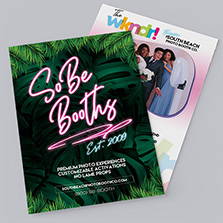
Paper Weight: Choose based on how your catalog will be used. Heavier text weights feel professional and hold color beautifully, while lighter stocks keep bulk mailers cost-friendly. If you want something that still feels high-quality without the added weight, 80# gloss text is that sweet spot.
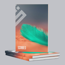
Coating: Your coating controls the finish and first impression. Gloss brings out rich color and shine, perfect for bold or product-heavy catalogs. Matte tones it down for a softer, modern look that’s easy to read. UV coating adds an extra layer of protection, especially smart for covers or catalogs that will be handled often.
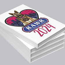
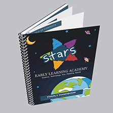
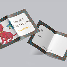
Binding: Think about how your catalog will be used and how long you want it to last. Saddle-stitching is ideal for smaller page counts or seasonal promos that need a quick turnaround. Perfect binding gives that square spine and premium feel, great for higher page counts, lookbooks, or end-of-year product collections.
Color control: This is where precision matters. Always check proofs and confirm your colors before going to press. We always recommend designing in CMYK and ordering a hardcopy proof before production. It’s the best way to see how your colors, paper, and coating work together.
Paper brightness, coatings, and ink builds can all shift the final tone. For seasonal designs, those small changes make a big difference, your warm holiday reds or soft spring neutrals should print exactly how you envisioned them.
Make It Count
Every season is a new chance to make an impression. When your catalog feels professional, cohesive, and on-brand, it builds trust before anyone even makes a purchase.
Seasonal marketing moves fast, but print lasts. A well-designed, well-produced catalog becomes something your customers keep on their desk, pass to a coworker, or flip through again when they’re ready to order. That’s the kind of marketing that still works, because it’s tangible, intentional, and human.
At PrintingCenterUSA, we’ve printed thousands of seasonal catalogs for brands across every industry. So when the season hits, your catalog looks and feels like it was built for that moment.