


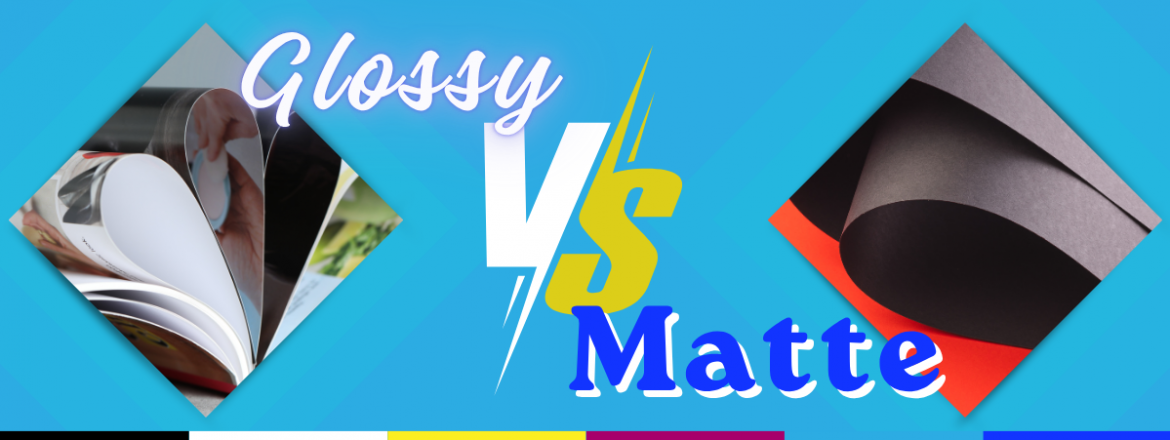
Matte vs Glossy: Which Paper Finish Should You Choose?
Choosing between matte and glossy paper is one of the most important decisions you will make for any print project. The finish you pick changes how your piece looks, how it feels in someone’s hands, and how well it communicates your message.
So which is better: matte or glossy?
There is no single correct answer, but there is a right answer for your project. Once you understand what each finish actually does, the decision becomes a lot easier. This guide breaks down the differences, when to use each finish, and how to make a confident call before you go to print.
Matte vs Glossy: Quick Comparison
If you are short on time, here is what you need to know.
Matte finish:
- Soft, non-reflective surface that absorbs light
- No glare, easy and comfortable to read
- Tactile, satin-like feel that reads as premium
- Resistant to fingerprints and smudges
- Colors look natural and true to tone
Glossy finish:
- Shiny, reflective surface that bounces light
- Colors appear more vibrant and saturated
- Images look sharper and more dynamic
- Slightly more resistant to scratches
- Shows fingerprints more easily
What Is Matte Paper?
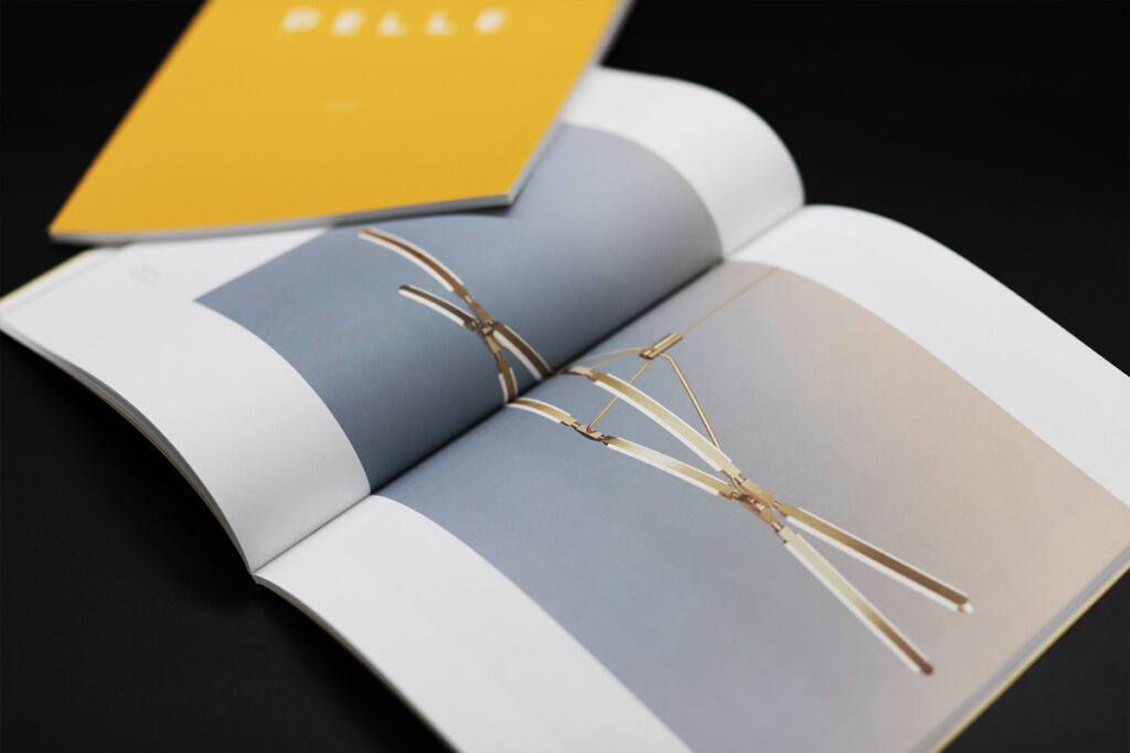
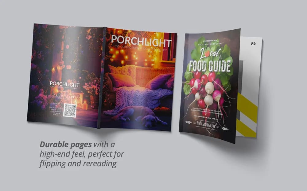
Matte paper is a coated paper stock with a smooth, low-sheen finish. A lot of people assume matte means flat or unfinished, but that is not the case. The coating gives matte paper a refined, satin-like surface that feels elevated without any shine.
What sets matte apart is how it handles light. Rather than reflecting it, matte absorbs it, which eliminates glare and creates a softer, more natural look. That is why text-heavy pieces and books almost always use matte. Reading under bright or overhead lighting is far more comfortable on a matte surface.
One thing worth knowing: matte paper is not the same as uncoated paper. Uncoated stock has no coating at all and feels rougher and more raw. Matte sits between uncoated and glossy, giving you a refined feel without the shine.
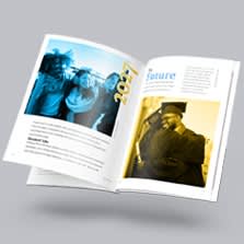
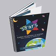
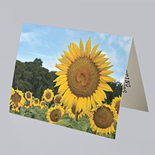
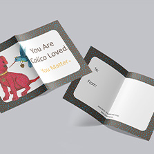
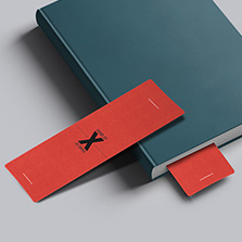
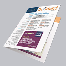
Best for: books and manuals, high-end catalogs, art prints, membership directories, text-heavy designs, professional and luxury branding, notebooks, and any piece that will be handled frequently.
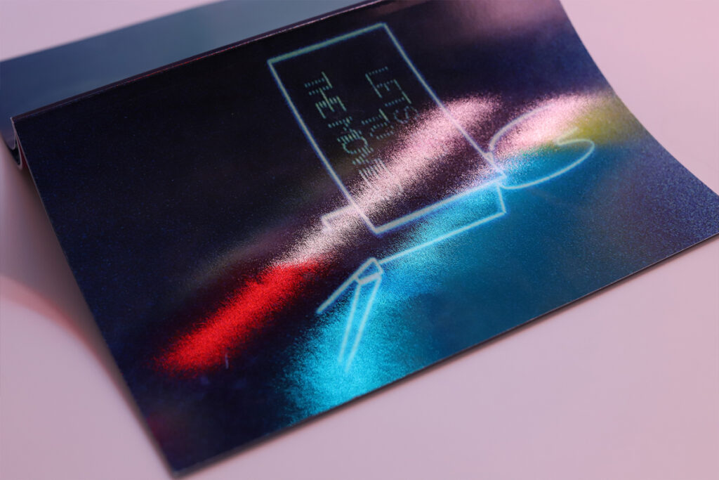
What Is Glossy Paper?
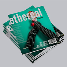
Glossy paper uses a higher-sheen coating that reflects light back toward the viewer. That reflection is what makes colors look richer, images appear crisper, and the overall piece feel bold and eye-catching. When you pick up a magazine and the cover practically glows, that is glossy paper doing exactly what it is designed to do.
The tradeoff is glare. Under bright or direct lighting, glossy surfaces can make text harder to read. For image-forward pieces this rarely matters. For text-heavy designs, it is worth factoring in.
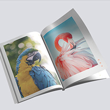
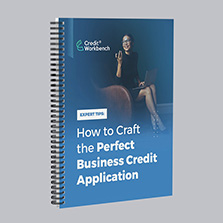
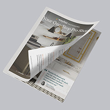
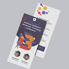
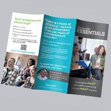
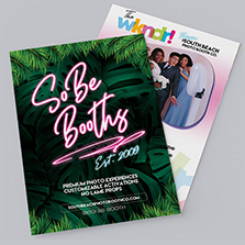
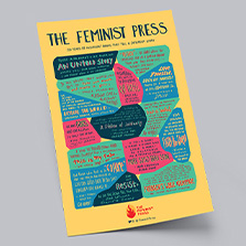
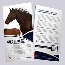
Best for: photo prints, marketing brochures, magazines, promotional materials, product catalogs with strong photography, and anything where stopping power and visual impact are the whole point.
Matte vs Glossy: Key Differences
Appearance: Matte is soft, subtle, and understated. Glossy is vivid, bold, and high contrast.
Texture: Matte has a smooth surface with a slight tactile quality. Glossy is slick and polished.
Readability: Matte is easier to read under any lighting condition. Glossy can create glare under bright or overhead lights.
Color vibrancy: Matte renders colors as natural and true. Glossy boosts saturation and makes colors pop.
Fingerprints: Matte resists smudges and fingerprints well. Glossy shows them more easily.
Durability: Glossy has a slight edge in scratch resistance. Matte holds up well with regular handling and stays looking clean longer.
When Should You Choose Matte?
Choose matte when your piece has a lot of text, when it will be handled frequently, when you want a professional or luxury impression, or when it will be read under bright lighting. Matte is also the right call when your brand voice is refined and understated rather than bold and promotional.
When Should You Choose Glossy?
Choose glossy when your design is image-driven, when you need colors to jump off the page, when you want to grab attention immediately, or when the piece is more visual than it is text-heavy. Glossy is the standard choice for anything promotional or photographic.
Matte vs Glossy by Product Type
Books and manuals: Matte. Long reads need glare-free comfort.
High-end catalogs: Matte. The finish communicates luxury and editorial quality.
Marketing brochures: Glossy. Maximum visual impact, colors that stop people in their tracks.
Photo prints: Glossy. Color depth and image sharpness are unmatched.
Magazines: Glossy. Bold imagery is the product.
Notebooks: Matte. Writable surface, no glare on covers.
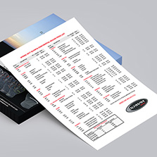
Membership directories: Matte. Practical, readable, holds up to daily use.
Product catalogs: Either. Depends on your brand tone and how much photography vs text you have.

Can You Mix Matte and Glossy?
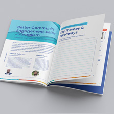
Yes, and it is a smart move for many projects. Glossy covers paired with matte interiors is a classic combination for catalogs and booklets. You get visual punch on the outside and comfortable readability on the inside. It is one of those details that makes a print piece feel intentional and well-crafted.
Does Matte or Glossy Last Longer?
Glossy paper has a slight edge in scratch resistance because of its denser coating. But matte holds up extremely well in everyday use, and its resistance to fingerprints and smudges keeps it looking clean over time. In practice, both finishes are durable for professional print runs. Longevity is rarely the deciding factor unless the piece will take serious physical wear.
Which Looks More Professional: Matte or Glossy?
Matte is generally seen as more professional for text-heavy or luxury materials. Its clean, understated look communicates confidence and quality without shouting. Glossy reads as bold and promotional, which is exactly right for marketing pieces but can feel out of place for something like an annual report or a premium catalog.
Both finishes can look professional. The key is matching the finish to the context and the audience.
What Our Customers Say
“I’ve returned to PCUSA with another client to create high quality books at an incredible price just in time for our major tradeshow. I will continue showing up with repeat business as they’ve earned my trust as Creative Director.” Patti L. Creative Director
Frequently Asked Questions
Is matte or glossy better for brochures? Glossy is typically the stronger choice for marketing brochures because it amplifies colors and creates immediate visual impact. If your brand leans premium or your brochure is text-heavy, matte can make an equally strong impression.
Is matte or glossy better for photos? Glossy is the standard for photo prints. It produces richer color depth and sharper detail. Matte photo prints have a distinct artistic look, but for maximum color vibrancy, glossy wins.
Does matte look more professional? For text-heavy or luxury print pieces, yes. Matte reads as refined and intentional. Glossy reads as bold and promotional. Both can look professional depending on the context.
Is glossy paper harder to read? It can be, especially under bright overhead lighting where glare makes text harder to follow. For anything with substantial copy, matte is the more comfortable reading experience.
Can I mix matte and glossy in one project? Yes. Glossy covers with matte interiors is a popular and effective combination for catalogs and booklets.
Is matte paper the same as uncoated paper? No. Matte is a coated paper with a low-sheen finish. Uncoated paper has no coating and has a rougher, more raw texture. They are distinct products.
Start Your Print Project with Confidence
Choosing between matte and glossy does not have to be complicated. Once you understand what each finish does, you can select the one that genuinely fits your design, your brand, and your audience.
Still not sure? Order a free sample pack and feel the difference yourself before you commit. You can also upload your file for a free file review and our team will help you make the right call.
Request a free sample pack Explore your printing options Upload your file for a free file review
Your perfect print starts with the right finish.