


PRINTING PUBLICATION DESIGN

When making any kind of printed product, it is important to keep publication design at the top of your mind so that your product is visually interesting, informative, and will keep your customers coming back for more. Publication Design is only one out of 8 different types of graphic design.
What is Publication Design?
Publication design in the layout and graphic design for printed materials such as newsletters, magazines, books, brochures, etc. As stated by99designs, “Graphic designers that specialize in publications work with editors and publishers to create layouts with carefully selected typography and accompanying artwork, which includes photography, graphics and illustrations.” When printing a product, it’s necessary to take your booklet design into account to create a high-quality and professional looking printed work. When utilized correctly, publication design can inform and instruct an audience through the combination of words, graphics, and layout.
Design Inspiration: Magazine

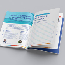
Publication design is used across all different types of publications and even then, the content has to be specific to a subject or genre. For layout inspiration, take a look at Bearings Magazine. Right off the bat you know that this is a magazine about boats and nautical news. The inside of the magazine retains the same design theme throughout, using similar colors, fonts, and images to communicate the purpose of their magazine to their audience. The design needs to express the theme of the magazine.
Design: Web Design for Publications
Publication design is also seen on digital platforms like blogs, online magazines, etc. The largest obstacle for publication design web design is that your product has to look great on different devices, which all have their own aspect ratio, screen size, and resolution. This may cause you to prioritize which products you are going to publish your work on.Here’s a digital publishing checklist, provided by Magazine Designing, that you can use to work through the relatively new world of digital publication design.
Publication Design Tips
So how do you effectively design visual masterpieces? You want your product to look visually pleasing while communicating the most important information to your consumers. Well, you are in luck because we have compiled some of the best design ideas! And what’s better is that these tips are not exclusive to just publication design.
Fonts
Limit the number of fonts that you use in your publication. This will help you have an aesthetically consistent theme across your project. Pick a font that is legible for the bulk of your text. This means no scripts! Try a font like Arial that has some mild variations that you can use like Bold, Black, and Italic for your headers or titles. Additionally, choose a font that will be your eye-catching font. This can be used for call-to-actions or to draw your customers eye to an important piece of information.

Images
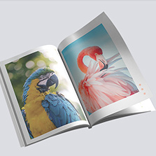
Choose images and graphics that are going to be consistent with the theme of your project. For example, if you are making a magazine that is about boats, don’t make the background of a page a forest because that won’t go with the theme of your magazine. Make sure that your images are well-lit, high-quality, and topical. Also, don’t be afraid do add a full spread. This can provide a nice break for your reader and highlight an image that captures the theme of your project.
The recommended DPI that you will need for printing is at least 300 DPI. Typically, images that are downloaded off of the internet, sent via email, or taken on your phone will not be at a high enough DPI to print clearly.

If you are planning to use graphics, try to use a vector graphic. This will allow your graphic to be scalable, which in turn maintains your graphics clarity. If you have found a graphic that you love, but it’s a raster graphic, make sure that you adhere to the 300 DPI rule that we outlined above.
White Space
White space can help you keep a good balance between text and images. Don’t let your print project get too cluttered looking by feeling like you need to fill up every nook and cranny of your page. White space can be a very useful tool, when used correctly.
Colors
Choose a color palette for your project and stick to it! Having an established color pallet will force you to stay within your theme and make it easy for you to create a cohesive looking project. Remember, it’s not only about the information in your project, your project has to be nice to look at to keep your audiences’ attention. Make sure you choose a contrasting color that you can use for important areas.
When printing, be sure that you are designing your project to be in CMYK instead of RGB. RGB is typically used for digital projects, while CMYK is used for print projects. Be sure you set this up at the beginning of your project so you don’t have to re-do any of your colors at the end.For more information on the difference between CMYK and RGB, see our blog post.

Body Copy
When creating a publication printing project, changes are your project is going to include some text, so it’s important to get it right. Make sure that the height between two lines of text (also known as Leading) is large enough that there is some breathing room. Don’t use single space! Nobody likes a block of text. If you have a paragraph of text, try not to create ‘widows’ or ‘orphans’. These refer to one word that is left to its own line, either at the bottom of a paragraph or on the next page. These are not good because they create an unnecessary break in the copy.
Navigation
Make sure that your project is easy for your readers and customers to navigate. This means including a table of contents, page numbers, and chapter/ section titles. This will help your audience to be able to find information that they are looking for quickly.
Publication Design for Mailing

If you are looking to create a product that you are going to have mailed directly to your customers, you are going to have to make certain concessions in your design to make room for the addresses and stamps. PrintingCenterUSA offers mailing services for a number of products like postcards, magazines, catalogs, and more! Our ailing services include Mailing Lists: CASS Certification, Move Update, Remove Duplicates Inkjet Addresses, Tabbing if required, and Delivery to post office. If you are looking to print a product with mailing services, download one of our free online templates that has the title ‘Mailing Version’. This will include a blocked off section for your address and stamp.
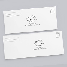
If you are planning to design your own product, without the help of PrintingCenterUSA’s templates, here’s what you need to know. The address is going to be printed on the back top half of your product. The section reserved for the customers’ addresses has to be 3 ¾” wide and 2” tall. It also has to be ½” from the trim line on the spine. The space between the address section and the spine has to be left clear. For the stamp, leave a 1” by 1” square blank in the top right corner of the back cover of your product. Please refer to the image above.
Publication Design Specifications
If you are looking to print a publication with PrintingCenterUSA, you have come to the right place! We offer many levels of customization so that you are sure to have a product that you and your customers are happy with!
Size
We have a wide variety of sizes in Portrait, Landscape, and Square mode. All of the following sizes are in inches.
For Portrait, we offer:
|
For Landscape orientation we offer:
|
For Square products, we offer:
|
And if that wasn’t enough, we also offer a custom size option! Just find the custom size button under our size drop down and enter your width and height. If the pricing tool gives you a quote, then we can print that size!

Cover Finish
We offer two different cover finishes for your publications: UV coating and soft touch lamination. You can also choose no coating, but that’s no fun. UV coating is a protective coating that can protect your project from scratching and scuffing caused by transport and frequent handling. It also gives your project a shiny gloss coating to make your photos and colors pop, as well as providing a truly professional look and feel. Soft Touch Lamination is a lamination technique that adds a velvety-smooth finish to the cover of your product. It adds durability and a unique feel that will capture the attention of your customers. We recommend this coating for 80# and 100# cover. Your end product will have a velvet feel and matte finish.

Ink
When printing with PrintingCenterUSA, you can choose from the following ink color options for your cover:
- 4/4 Full color on the front and full color on the back
- 4/1 Full color on the front and black on the back
- 4/0 Full color on the front and no printing on the back
- 1/1Black on the front and back
For your inside pages, you can only choose 4/4 or 1/1.
Publication Design with PrintingCenterUSA
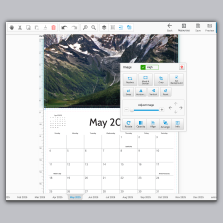
PrintingCenterUSA provides lots of resources for our customers so that they can create the best print project they can! We provide free downloadable templates so that you don’t have to worry about your file specifications and a free online design tool if you don’t have any design software. We also have a24/hr Help Center with a search bar that is sure to answer any question about printing that you may have!
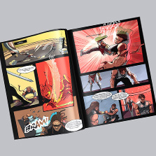
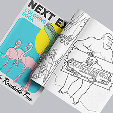
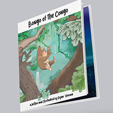
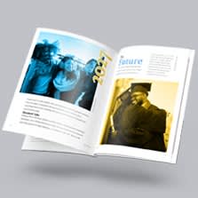
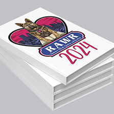
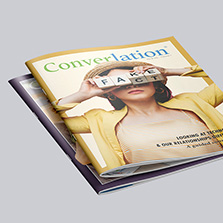
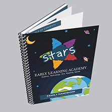
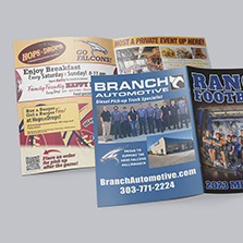
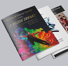
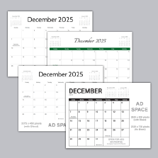
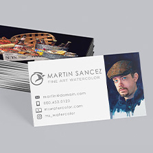
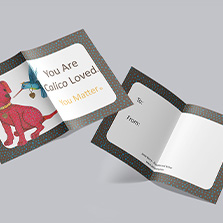
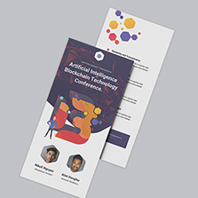
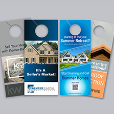
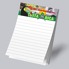
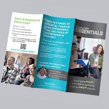
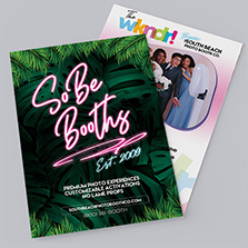
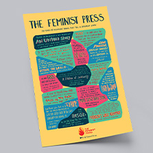
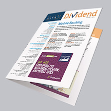
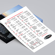
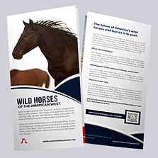
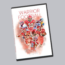
Check out some of our most popular publications with PrintingCenterUSA for inspiration: