



























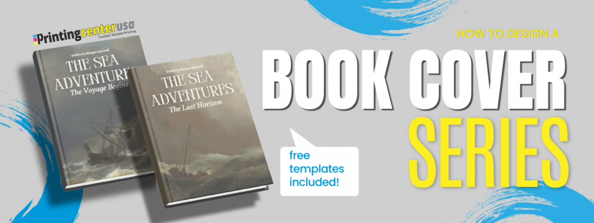
How to Design a Book Series Cover
Is designing your book series cover keeping you from publishing? Could this be preventing you from reaching your marketing goals? The content of the book is most important to you but the reader will often judge a book by its cover. As an author or designer, book covers can break your series’ success or help build your book empire! Designing one cover is hard enough. Designing one book cover is a challenge within itself, and a series raises the stakes. Now every book that comes after it should look like it belongs with the one before it. If you’re able to balance it, readers can ideally spot your series from across a bookstore.
Designing a book series cover means finding that right thing that ties every book together while still giving each cover its own individuality. Let’s help complete the covers for your book series and get those stories published.
Do Book Series Covers Need to Match?
Book series covers need to match, for the most part. Readers expect the books in the series to look like they’re part of a set. If they don’t, sometimes it can cost you sales. This doesn’t necessarily mean every cover has to be identical. There just needs to be a common thread running through it, so that whenever someone sees book 1 or, say, book 7, they know instantly it’s yours.
Look at reputable series for inspiration, like:
- The Witcher by Andrzej Sapowski: Each book of the eight-book series is a different color with a different medallion in the middle. The author location and the title location are the same in the same font. It looks like it’s part of a cohesive set.
- Red Rising by Pierce Brown: Each book of the six-book series has its own image, but the title positioning is in the same place, as well as the author location, and it’s in the same font. The first three books also have a black background. Even when you put all six of them together, you can tell it’s part of a cohesive set.
- Twisted Series by Anna Huang: Overall, the design looks the same. They have different colors, and the fonts are all the same as well. They look like they’re part of a set.
- Throne of Glass by Sarah J. Maas: Each book looks different, but the title and font placement stay the same, and the colors are all within the same color palette. They look like they’re part of a set.
Pro tip: imagine what your series would look like if you lined up each book next to each other
What Stays Consistent on a Book Series Cover?
- Keep your book size the same so the books sit flush together when they’re on a shelf. Varying sizes will break the set when they’re lined up. With readers today, they love an aesthetic final book set.
- Pick a font family for your titles and author name and stick with it. Changing typography can make a set look unplanned.
- Choose one art style: illustration, 3D, photography, minimal, just whatever fits your genre, and use that same style on every cover. Obviously, it doesn’t have to be the same image every time, but it should be in the same style realm. Mixing styles can make it hard to recognize your books as connected.
Can Books in The Same Series have Different Covers?
Books in the same series should have different covers. The series shouldn’t ever have every cover be identical except for the title. It gets boring fast, and it can make the individual books harder to tell apart. No matter what, there should be some varying degree of individuality. You can still be minimalistic without changing much, but make sure they look different. The goal isn’t likeness; it’s a balance between consistency and character.
Book size, typography, and image size should stay the same throughout the series. Here’s where you have room to vary:

Color: Establish a color palette for the series. Let the dominant color shift book to book.
Recurring elements: A signature symbol, object, or character that shows up on every cover, styled a little different each time.
Evolution: Covers can intensify as the story escalates.
How to Design for Books You Haven’t Written Yet
If you already know how many books will be in your series and what they’re called, you’re one of the lucky ones. Most authors don’t, and that changes how you should design the first cover and position your title in a way that is flexible.
If your first book title is one word, don’t build a layout that only works for one word. Test it with a longer multi-line title to play around with it, because maybe that one word you want is in a large font. Position the second line below it and play around with where it’s going to live.
If you’re working with a designer, tell them up front that a sequel’s coming, even before you have a final title. A layout built around one title length can be hard to replicate if the next book’s title comes in a lot shorter and longer. Give them just something to work with so they can test the layout before anything is locked in, and ask for cover concepts, not cover variations, just kind of tweaks. One design concept can build the rest of the series on, having to shift gears after book two.
Book Series Cover Templates
Deciding the layout of your book series cover can be challenging. Keeping the design uniform and similar between books using templates can help the consistency of your brand. This will elevate your overall aesthetic and help readers remember you.
How Book Cover Templates Help Your Brand
- Consistency: Templates create a uniform look and feel to help you build a recognizable brand.
- Professional Appearance: Use templates to elevate the look of your cover to a professional design.
- Time Efficiency: When the design is predetermined by the template you don’t have to navigate things like balancing your elements.
- Cost: Templates are usually more affordable than hiring a designer.
- Brand Marketing: Adding things like your brand colors and logo can personalize the temple.
- Flexibility: While your template is structured feel free to customize it and add external elements to freshen up the content.
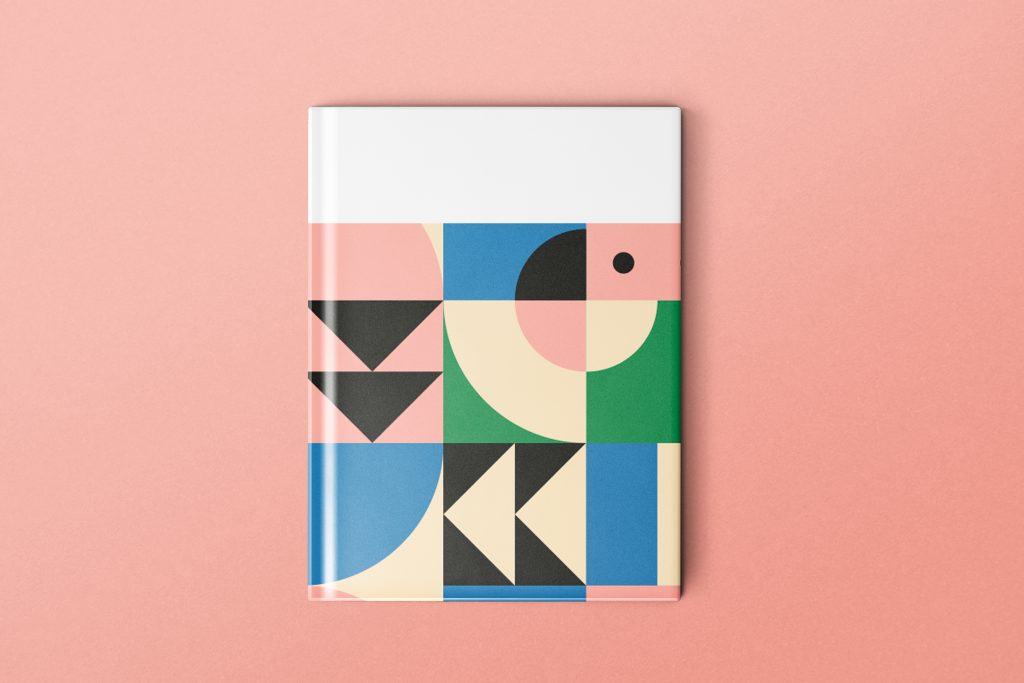
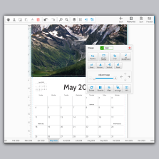
At PrintingCenterUSA we offer free dynamic templates for inside pages as well as cover pages and spines. Click here to watch how to use them. Click here to see more free templates offered by Canva. Click here to get in contact with a recommended PCUSA designer. There are many sites and private designers you can purchase templates from. The options are endless!
Keep these quick tips in mind when you go to create your book covers for the series to keep everything organized. For more in-depth information on how to design your cover, read our blog, “Book Cover Design Ideas“. If you would like “Design Tips for Creating Eye-Catching Book Covers” click here!
How Do I Keep A Series Consistent?
After writing, editing, and designing, self-publishing your book might be the easiest part of the process. However, the decisions like your book’s paper weight, the cover’s finish, and binding style are still important. Here’s how a professionally printed book can make a difference for the book’s aesthetic and your brand.

Printing’s Impact on Aesthetics
- High-Quality Materials: PrintingCenterUSA offers premium quality materials including paper and finishes to enhance the look of all products.
- Consistent Printing: With PrintingCenterUSA’s top-of-the-line presses & G7 Qualification you can expect accuracy & consistency across every book cover in your series.
Printing’s Impact on Branding
- Professionalism: Having a consistent printer can bring an additional level of authority to your book and give it the power to fly off the shelf.
- Credibility: A credible source of printing is ideal. This way you can have faith that everything is up to industry standards.
- Differentiation: Unique printing options like finishes can help differentiate your series from the rest. Pick a printer that will help you stand out from the crowded publishing industry.
Pro Tip: When you order from PrintingCenterUSA you get a free digital copy of your book to share with friends or sell online.
We all try to avoid being judgmental but it’s nearly impossible not to judge a book by its cover. Your brand’s credibility can heavily influence someone on the fence about making a purchase. When your audience remembers what your books look like your brand gains authority. Here are some ways your brand can impact readers of your book.

- Attracts Attention: A visually demanding book cover creates curiosity which adds value to the mystery of what is inside. Almost like an anticipated surprise for the reader.
- Creating First Impressions: Capturing the reader right away sets high expectations for quality. This influences how they read and recommend your book.
- Encourages Purchase: Your cover alone could be the deciding factor for a skeptic to choose your book. Make sure they know they aren’t just reading a book; they are entering a binge worthy series. Imagine a reader who didn’t like your first book but couldn’t stop themselves from buying the second because of the cover.
- Marketing Tool: Create a memorable book cover as powerful as a Super Bowl ad. Which one comes to mind?
- Builds Anticipation: Attention grabbing covers build anticipation for the next book in the series. Successful book covers start trends using teasers for their next big story.
Put yourself in the shoes of someone whose friend just recommended “the best book ever” to you. What does the cover look like? The cover of your book series should bring your audience in like a magnet. It should stand out with a clean, professional look and feel. Upload your book cover now and select hardcover or perfect bound binding for that traditionally published style!
FAQ About Book Series Design
How do book cover design options compare for long-term scalability and brand consistency?
The options that scale best are the ones built around a template or a locked set of foundational elements, trim size, typography, and image style, rather than a custom one-off design for every book. A template-based approach makes it far easier to add new books to a series later without breaking the visual consistency you’ve already built.
How should I approach designing a book cover that will help readers discover my book?
Start with your genre and your audience, since those two things drive nearly every design decision from there. For a series specifically, also decide your foundational elements, specs, typography, image style, before you design book one, so every future cover can build on the same base instead of starting from scratch.
How can I use a book cover to build trust with potential readers and increase commercial success?
Consistency is the biggest lever here. When every book in your series looks intentional and connected, readers read that as professionalism, and professionalism reads as trustworthy. A consistent, well-printed series also makes it easier for readers to buy the next book on sight, without needing to double check it’s really part of the set.
Do all books in a series need the same binding?
Generally, yes. Switching between paperback and hardcover partway through a series makes the set look inconsistent on a shelf, even if every individual cover matches. Pick one binding style for the whole series and stick with it, or intentionally offer both formats for every title rather than mixing and matching mid-series.
Can books in the same series have different covers?
Yes. What matters is that they share a common thread, matching specs, typography, and art style, while still having room to vary in color, character positioning, or recurring visual details. Completely identical covers aren’t required and can actually make individual books harder to tell apart.
How much does it cost to design a book cover?
It depends on the route you take. A free template gets you a professional layout at no cost beyond your own time. Working with an in-house or freelance designer runs more but gets you a fully custom design built around your series from the start. For a series specifically, factor in that a strong first cover concept can be reused as the foundation for every book that follows, so it’s often worth the higher upfront cost of a real concept over a cheaper one-off design.
What makes a good book series cover?
A good book series cover balances consistency with individuality. The specs, typography, and image style stay the same across every book, while color, recurring symbols, and tone can shift from one book to the next. Readers should be able to spot the whole series at a glance, while each cover still feels distinct enough to represent its own story.
Publish Your Book Today!
A recognizable book cover is not only the final step in the process but a crucial marketing tool that will build your brand and drive sales to your series. When you understand your audience, use templates, and use high-quality printing options you know your book covers will be as compelling as the stories inside them.
Make your mark today and stop by PrintingCenterUSA to access templates, tips, and premium printing. We help authors, who love our books, create professional and clean covers that elevates their brand. We know having a strong, recognizable brand is important. Keep yours consistent by clicking here to order now!