


















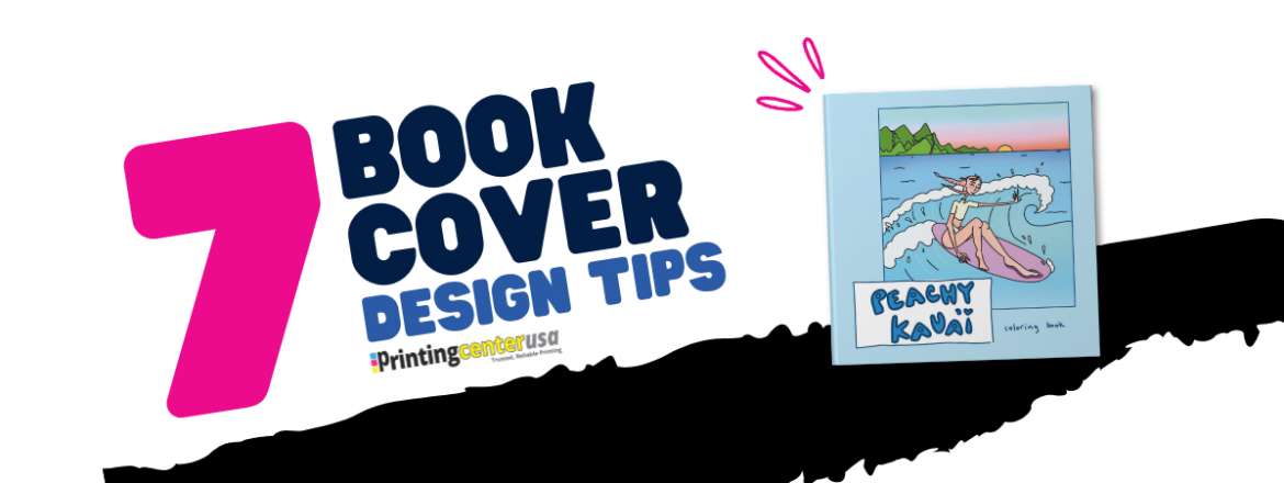
7 Book Cover Design Tips
The book industry is booming now more than ever! 4.2 million new book titles were published in the U.S. in 2025 alone. Self-published titles jumped 38.7% that year to more than 3.5 million of that total. Book covers have become an essential piece of standing out.
Designing a book cover is honestly a lot like the modern dating world. Sometimes it’s a dating app swipe-right situation. Other times it’s spotting someone across the room. Either way, first impressions are doing a LOT of heavy lifting. And books only get a few seconds to make that impression. Think about it. You’re scrolling online looking for your next read. You’re browsing aisles in your local bookstore. Hundreds of covers are flying past your face at lightning speed. Your brain is making split-second decisions the entire time. That’s the power of a book cover. Your cover is basically your book’s profile picture, opening line, outfit, personality, and overall vibe wrapped into one tiny rectangle. No pressure but the cover shows readers what kind of experience they’re about to commit to before they even read the description.
Good book covers create curiosity. They make someone stop scrolling, so we’ve compiled the best 7 book cover design tips to make sure your eye-catching cover is the stand out it needs to be!
1. How to Choose the Right Font for Your Book Cover
Your font should be easily readable and match your book’s content.In the font world, size does matter. Eye catching fonts are really what are going to make your book cover stand out the most. Pretend all your readers need glasses. The bigger the font, the more it’s going to stand out in the bookstore aisle, a computer screen as a thumbnail, or better yet, as a tiny image on your e-reader when you’re choosing what book next to download to chip away at your never ending “to be read” list.
If your title can’t be read easily and doesn’t match the vibes of the story you are presenting, you’ve already struck out.

Here are some font suggestions by genre:
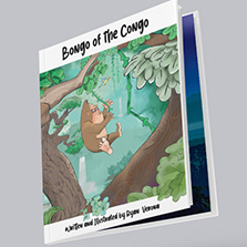
- For children’s books, fonts on your cover should be playful, whimsical, bubbly, and most importantly easy to read. Pacifico, Fredoka, Quicksand, and Storybook fonts instantly fit in.
- Thriller fonts on your front cover should feel anxious, sharp, cinematic, urgent, or slightly unsettling. They should make your reader feel stressed before chapter one even begins. Futura, Helvetica Neue, League Gothic, and Roboto Condensed are all fonts that work perfectly because they help build the suspense.
- For romance or memoirs, font on your front cover need to show emotion. Montserrat, Poppins, Bodoni, Cinzel, and even Baskerville are all fonts that add emotional depth to a cover. They help show the meaningful experience the reader is about to jump into
2. How to Choose Imagery That Matches Your Book Genre
Your imagery should give readers a solid idea on what they’re getting into, without spoiling the whole story. Your images should create a curiosity gap and entice readers to want to pick up the book. Think of it as a dating profile. If someone’s whole profile tells you their whole story before you’ve even said hello, where’s the fun or mystery in that? Book covers work in the same exact way. So think about how much or how little you want to reveal.
Does your children’s book/fantasy novel need to be covered in dragons and fairies everywhere? Or would one mysterious landscape actually say more? Does your romance novel need the main characters front and center, or would subtle clues feel more personal? Maybe it’s the café they always meet at. Maybe it’s the skyline that quietly means everything by the final chapter. Maybe it’s the bumblebee tights that she can’t live without.
And thrillers? The shadows, harsh colors, empty hallways, or even just the feeling the cover gives off, hints that something terrible is waiting inside. The tiniest details can really work well for thrillers. Sometimes the scariest covers are the ones that make your stomach feel weird without you knowing why.
When you choose the right images and design elements you showcase your book in the best way possible!
3. Should You Choose a Glossy or Matte Book Cover Finish?
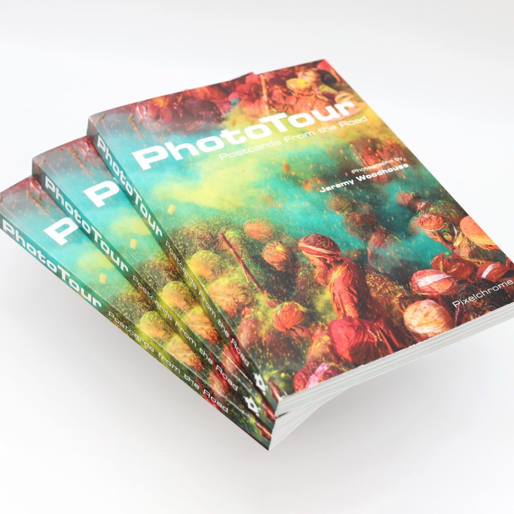
Is a book cover finish an important factor? It absolutely is, and something worth spending time on deciding. You’ll encounter different book cover finish names across different printers, but the most common ones you’ll find that PrintingCenterUSA offers are:
- Gloss lamination
- UV high gloss
- Soft touch lamination
This is essentially just making the decision of glossy versus matte. Gloss is the finish that catches the light across the table and makes your colors look bright & saturated. Matte is the total opposite of that. It’s flat with no shine and doesn’t show fingertips the way gloss can. Soft touch lamination takes matte one step further. It has no shine, but it feels like velvet.
No finish is better than the others. They just show off different things based on the design that you went with for your book cover. Here’s what we would recommend by genre:
- Children’s books are typically built with really vibrant color, so you want something that helps those colors feel even brighter, richer, and more energetic, especially with illustrations
- Matte works the best for thrillers. The matte makes the darker feel moodier, grittier, and more cinematic, giving that “something bad is definitely going to happen here” energy in the best way possible.
- Romance books and memoirs are where soft touch lamination can absolutely elevate a cover. Memoirs and romance novels really feel incredible with that velvety finish because it instantly creates a softer, more intimate feel. The second someone picks up the book, it wants to be held, and it’s craving that second “can’t get enough of you” touch.
4. Where Does the Author Name Go On a Book Cover?
Your name should feel like it belongs on your book cover and not added on as a last minute afterthought. It also can’t overcrowd the book title. It’s all about balancing elements. It’s important to remember that your name as an author is your brand. Every book you publish after this one holds weight. Ideally, a reader will follow you to keep up with your new published titles.
When thinking about the author name placement, most default to the bottom of the cover, right below the title. This is the traditional spot and what most self-published authors end up doing. Top-of-cover placement is built for authors who already have a reputable name behind them. For example, Stephen King’s name already holds enough weight, where it immediately sells the book. When readers have a beloved author that they stand behind, their name sells it. It’s that same thing in pretty much all of pop culture, like music, actors, or anyone you already are familiar with, trust, and love. If that’s not you yet and you’re just getting started, bottom placement of the cover is best just because it’s how the reader’s eyes are already trained to move across the cover.
It’s just like dating profiles. If someone’s on Raya and they recognize a public figure they love already. It’s an immediate swipe right. They don’t need any convincing because they already know who they are. You wrote the book. You’re the one that survived the brainstorming and the rewrites and the “maybe I should delete this entire chapter” moments. Your name deserves to feel like it’s a part of the cover, but it has to be balanced.
5. What Makes a Book Cover Look Unprofessional?
You know the feeling: you put your cover next to five bestsellers in your genre to see how it looks, and something’s off. You don’t know what it is, but it just doesn’t feel right next to the others.
Usually, it’s one of a handful of things:
- Too many fonts or design elements fighting for attention
- A stock photo that’s clearly a stock photo
- Stretched or low resolution images
- Doesn’t look right as a thumbnail.
The biggest one, is skipping the thumbnail test. Zoom your cover out until it’s the size that’ll appear online, roughly 150 pixels wide, so tiny next to a dozen other covers. If your title disappears or your image turns into a blur at that size, fix your cover design to where it can stand out when it’s laid out that way.
6. How to Prepare your Book Cover file for Print
For print, 300 DPI is your best friend because it keeps your cover looking professional and high-quality. Print also uses CMYK color mode, not RGB like your phone or computer screen. Designing in CMYK from the beginning can help avoid those unexpected “Wait, why does this look different?” moments later on. Your cover has to work in both online and print formats. That means things like color, bleed, image placement, and even spine design become incredibly important. Here’s a quick checklist for print-readiness:
- Images at 300 DPI or higher
- Designed in CMYK
- Bleed added on all sides (0.125)
- Important text and images kept inside the safe area
- Spine text sized and aligned correctly
- Cover checked at online thumbnail size before sending to print
7. How Does Your Binding Choice Affect Your Book Cover Design?
The binding that you choose can make or break your design because every binding style changes the way your book feels in someone’s hand. Are you going saddle stitch? Are you going perfect bound? Are you going hardcover? What binding will you choose?
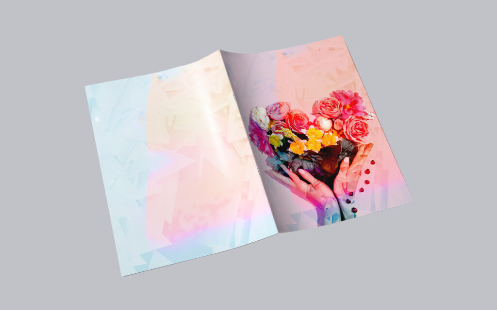
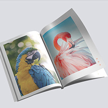
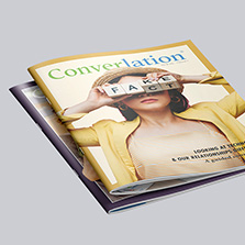
Saddle stitch books have that classic magazine-style feel and lie flat when open, which works for shorter books, children’s books, and photo-heavy designs. It’s lightweight and really easy to move around with
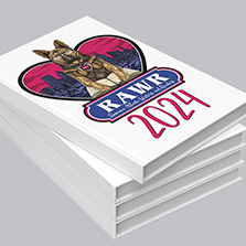
Perfect bound books or paperback book instantly give more of that polished main character energy look with a printable spine that displays your title and author name while sitting on a shelf. It’s also the book that the majority of readers are familiar with.
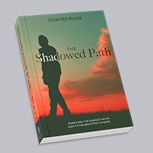

Hardcover books breathe luxury. Think about the last hardcover you picked up. It had a beautiful design, the kind of classic look you’d actually want to display. Readers pick up on that aura and the durability instantly, even if they couldn’t tell you why. Just like perfect bound, the spine’s printable with your title and author name are still front and center on a shelf.
If you’ve chosen perfect bound or hardcover for your book, you have to make sure you have enough bleed and safe area around your edges and spine. You don’t want any important text, illustrations, or details getting trimmed too close or disappearing into the gutter near the binding.
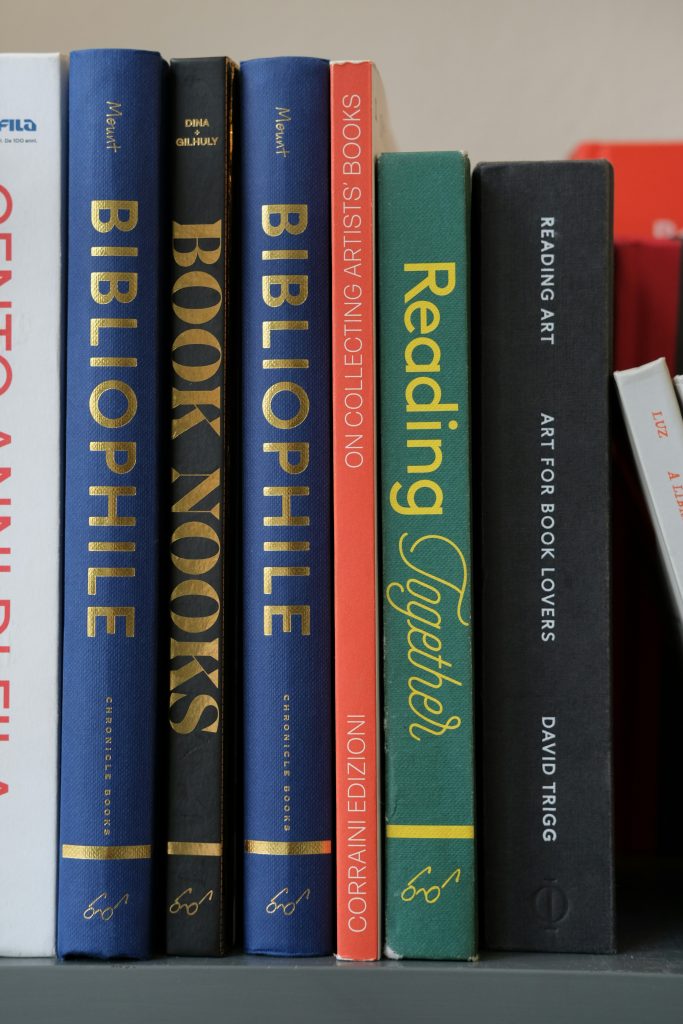
Do not forget about the spine. Your spine is sometimes all the reader sees sitting on a shelf. It’s like making eye contact with someone from across the room before the introduction happens, and it’s the first thing people notice. Any text on the spine should be readable and visually connected to the front cover design, so the entire book feels cohesive from every angle.

Recap: 7 Book Cover Designs Tips
At the end of the day, the combination of all these design tips will help create an eye-catching cover. A great cover will make someone stop scrolling, pause in the bookstore aisle, or stare at their e-reader for an extra second and think: “Okay… what’s this story about?” So do just that, make them stop scrolling. Halt them in the aisle. And between you and me, make them curious enough to want a second look. Because the right book covers don’t just sell a book. They invite someone into your world. Apply these 7 book cover design tips to stand out!
- Font Recommendations by Genre
- Romance: elegant, emotional, soft
- Thriller: sharp, tense, cinematic
- Children’s Books: playful, bubbly, easy to read
- Memoirs: personal, timeless, emotional
- How to Choose Imagery That Matches Your Genre
- Give readers a vibe check, not the whole plot
- Children’s/fantasy: dragons and fairies, or one mysterious landscape
- Romance: subtle clues over main characters front and center
- Thriller: shadows, harsh colors, empty hallways
- Should You Choose a Glossy or Matte Book Cover Finish?
- Gloss Lamination: bright, colorful, energetic covers, best for children’s books
- Matte Finish: moody, dramatic, cinematic feel, best for thrillers
- Soft Touch Lamination: velvety, luxurious, emotional feel, best for romance and memoirs
- Where Does the Author’s Name Go on a Book Cover?
- Bottom of the cover, below the title, for most authors
- Top of cover reserved for authors with name recognition
- Second-largest text on the cover after the title
- Also appears on the spine
- What Makes a Book Cover Look Unprofessional?
- Too many fonts fighting for attention
- Stretched or low-res stock imagery
- Skipping the thumbnail test (roughly 150 pixels wide)
- Print-Ready Checklist
- Images at 300 DPI or higher
- Designed in CMYK, not RGB
- Bleed added on all sides
- Important text and images kept inside the safe area
- Spine text sized and aligned correctly
- Cover checked at thumbnail size before sending to print
- How Does Binding Choice Affect Your Book Cover Design?
- Saddle Stitch: lightweight, lies flat, best for shorter books, children’s books, photo-heavy designs
- Perfect Bound: polished, familiar shelf look, printable spine
- Hardcover: premium, durable, printable spine, built to display
FAQ: Book Cover Design Tips
What are the four elements of a book cover?
The four elements are typography, imagery, color, and layout. Typography covers your title and author name. Imagery sets the tone and genre. Color triggers an emotional reaction before anyone reads a word. Layout is how all three come together so nothing feels crowded or off balance.
What is the best app to design a book cover?
Canva and Adobe Express are the most beginner friendly options, and both have free book cover templates. PrintingCenterUSA’s free online design tool works well too, especially if you’re planning to print with us, since it’s already set up for the right dimensions and bleed.
Can ChatGPT design a book cover?
Not on its own. ChatGPT and other AI tools can generate cover concepts or imagery, but they don’t manage the print-specific details like bleed, spine width, or CMYK color, so you’ll still want to bring that image into a proper design tool before sending it to print.
Ready to Make It Print Official?
At PrintingCenterUSA, we’re here to make this whole process feel a lot more doable and a lot less overwhelming. Think of us as the “extra hand” you need in the office. After 54 years, we’ve seen a lot of book covers, the good, the great, and the “maybe Open Sans wasn’t the one” moments. With our free online design tool and our ready-to-go design templates, you can design your book cover and your book with no extra costs. If Canva is your solid go-to, you can even connect your project and we’ll show you how! And if you still need that extra help, we’ve compiled a list of trusted graphic designers we can point you to, designers that are well versed in the PCUSA world and can help you every step of the way! We’re here to help you make this happen! Affordable book printing has never been so easy!
Whether you’re planning to sell your book, share your story for the office or a corporate event, or create something meaningful for friends and family, PrintingCenterUSA is here to help turn your book from a rough draft into its final glow-up. Because just like dating, first impressions matter… and when the right cover catches your eye, it’s hard not to want to know more about the story.