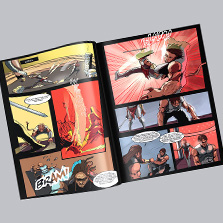
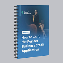

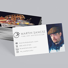

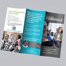

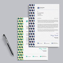
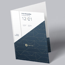


How to Design a Book: 9-Step Guide for Beginners
When you design a book, it is one of those things that feels overwhelming until you get started and break each section into steps. Whether you are working on a cookbook, a memoir, a children’s book, a business manual, or a photo collection, the process is the same. You make a series of decisions in the right order and each one sets up the next. This guide walks you through all of them so you can build from blank document to print-ready file with confidence. Visit the book page and download the free printing guide for book creation or start your book project today!
Quick Answer: How Do You Design a Book?
Designing a book involves choosing a size, selecting a binding style, organizing your content, creating a consistent layout, preparing high-quality images, and exporting print-ready files. Following a structured process from the start prevents the kind of rework that costs time and money later.
Step 1: Choose Your Book Size
Size is the first decision you make because everything else, typography, imagery, layout, and binding, flows from it. The right size depends on your content type, your audience, and how the book will be used.
Standard sizes are the most cost-effective and the most familiar to readers. They print efficiently, ship affordably, and work for the vast majority of book projects. Custom sizes are available when your content genuinely calls for something unique, but they come at a higher production cost and can complicate distribution.
Here is how common sizes map to common book types:
5.5 x 8.5: memoirs, journals, and novels where a compact portable format suits the reading experience
6 x 9: the most common size for nonfiction, business books, and trade paperbacks
8.5 x 11: cookbooks, manuals, textbooks, and workbooks where you need space for both text and images
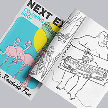
8 x 8: children’s books, photo books, and square-format creative projects
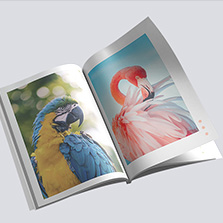
11 x 8.5 landscape: photo books, art collections, and visual storytelling projects where horizontal layouts shine
Size also affects typography. A larger format gives you room for creative layouts and bigger fonts without feeling cramped. A smaller format requires more careful font choices to keep the reading experience comfortable. And imagery scales with your format too. Full-page photo spreads that look stunning at 8.5 x 11 can feel crowded and small at 5.5 x 8.5.
Download a free book template from PrintingCenterUSA to start designing in the right dimensions from the first click.
Step 2: Choose Your Binding Style
Binding affects durability, usability, appearance, and cost. Here is how to match your binding to your project.
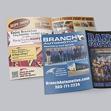
Saddle stitch is the most affordable option, stapled along the spine and ideal for shorter publications up to 64 pages. It lays flat when open and works well for booklets, magazines, and shorter guides. It is not the right choice for anything that needs to feel substantial or will be referenced repeatedly over time.
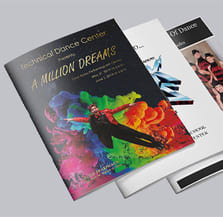
Perfect binding gives you a square printable spine and a clean professional appearance. It is the standard for novels, business books, corporate reports, and anything that will sit on a shelf. It requires a minimum of 28 pages and accommodates higher page counts than saddle stitch.
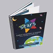
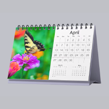
Spiral binding uses a plastic coil that allows pages to lay completely flat and rotate a full 360 degrees. It is the go-to choice for workbooks, manuals, cookbooks, planners, and any book that needs to stay open hands-free during use. It is durable, practical, and one of the most flexible options on page count.
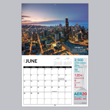
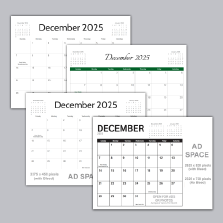
Wire-o binding works similarly to spiral but uses a double-loop metal wire for a cleaner, more polished appearance. It is popular for calendars, presentations, and professional reference materials where the finished piece needs to impress as well as function.
Not sure which binding is right for your project? Request a free sample pack from PrintingCenterUSA and feel the difference between binding styles before you commit.
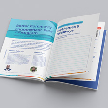
Step 3: Build Your Layout and Outline
Before you open your design software, build your outline. Think of it as the architectural plan for your book. Where does the table of contents go? How are chapters organized? Where do images sit relative to text? Are there full-page spreads? Blank pages between sections?
Getting this structure right on paper before you start designing saves hours of rework later. Decide the format for your images early: are they full-page bleeds, tiled layouts, single images centered on the page, or integrated with text? Each choice affects how your pages are set up and how your margins need to be configured.
Once your outline is solid, add your navigational elements. Page numbers should be placed consistently throughout, either in the bottom corner or top center, and should feel like part of the design rather than an afterthought. Chapter titles at the top of each page help readers orient themselves quickly. A clear table of contents placed early in the book with accurate page numbers is the difference between a book that feels professional and one that does not.
Step 4: Set Up Margins and Bleeds
Getting your margins and bleeds right at the start of your design process is one of the most important technical decisions you will make. Setting them up incorrectly means going back and adjusting every page after the fact, which is exactly the kind of work nobody wants to do at the end of a project.
Margins define the safe zone where your content lives. For outside margins, set at least 0.5 inches on the top, bottom, and outer edge. For binding margins, set at least 0.8 inches to account for the spine and ensure nothing gets swallowed in the bind. For spiral and wire-o binding specifically, set your binding-side margin to 0.875 inches to leave room for the coil.
Bleeds apply when any image or graphic element extends to the edge of the page. Set your bleed to 0.125 inches beyond the trim line on all sides where content bleeds off the page. If you set this up in your template from the beginning, your images will be sized and positioned correctly from the start.
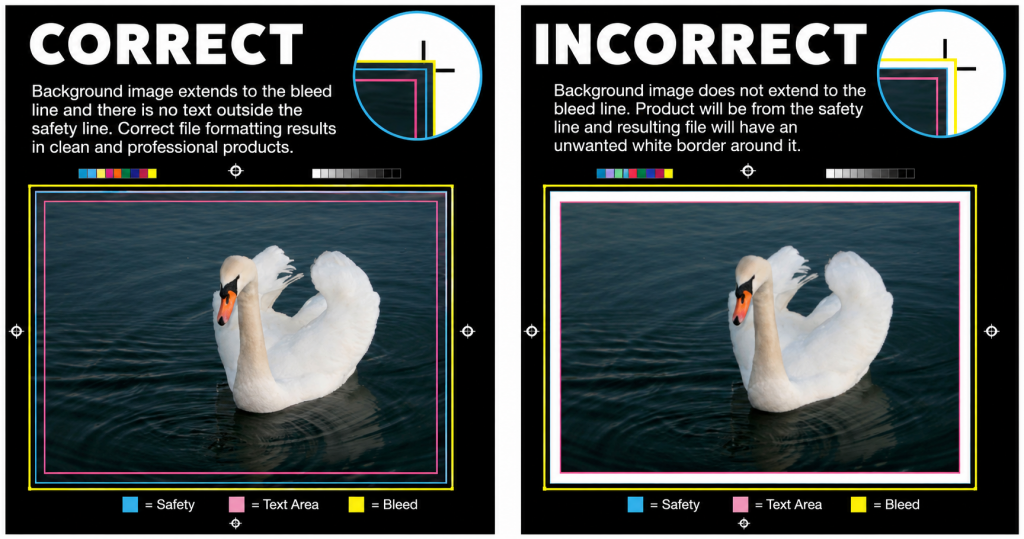
Use our free Adobe templates for your book size and binding type and all of these settings are already configured for you.
Step 5: Choose Your Fonts and Typography
Typography is one of the most powerful tools in book design and one of the most commonly mishandled. The fonts you choose, and how you use them, shape the entire reading experience.
For headers and chapter titles, a creative or display font works well because it adds personality and visual interest at a scale where it reads clearly. For body copy, choose a clean readable font and stay with it throughout. Serif fonts like Garamond, Georgia, and Sabon Next are classics for a reason. They are highly legible at body text sizes and have a warmth that suits long-form reading. Sans serif fonts like Helvetica, Arial, and Avenir Next work well for more contemporary designs or layouts that combine a lot of text with graphic elements.
Limit yourself to three to five font types and weights across the entire project. Consistency is what makes a book feel intentional rather than assembled. If you choose a font family that includes multiple weights like bold, italic, regular, and thin, you can create hierarchy and variety without introducing additional typefaces.
For font sizes, here is a reliable starting framework:
Chapter titles: 24 to 36 pt for a bold graphic presence that helps readers follow the structure.
Primary headers: 16 to 24 pt to separate major sections clearly.
Subheaders: 12 pt bold to distinguish subsections without competing with primary headers.
Body copy: 10 to 12 pt regular. Many designers default to 12 pt because it feels safe but 10 pt in a clean legible font is entirely readable and gives you more breathing room on the page.
Page numbers and footnotes: 8 pt so they register as navigational rather than content.
Set your font size rules at the beginning of the project and stick to them. It is much easier to maintain consistency when the rules are established before you have 200 pages to go back and fix.
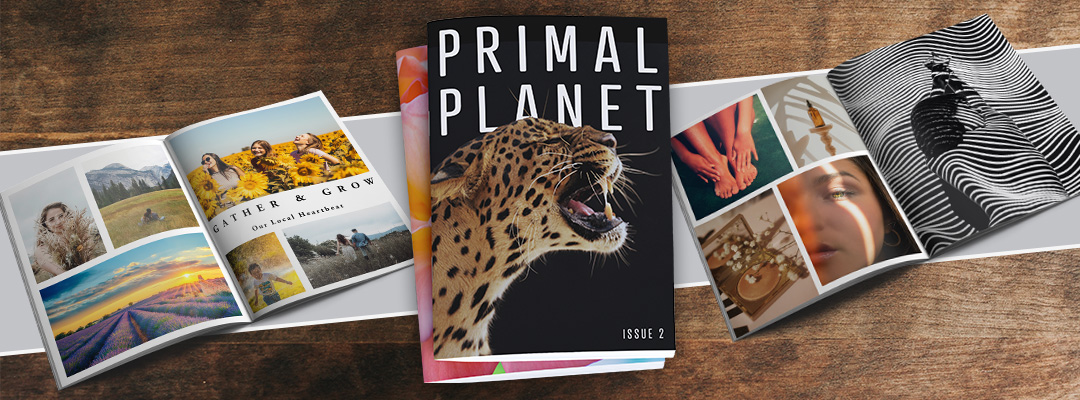
Step 6: Use High-Quality Images
Images make or break a book design. A stunning photo printed at the wrong resolution looks blurry and amateurish. A mediocre image at the right resolution still looks mediocre. Both matter.
For print, images should be 300 DPI minimum. This is not a suggestion, it is the standard for professional print quality. At 300 DPI your images will be crisp, detailed, and rich in color. The absolute minimum acceptable resolution for print is 200 DPI, though 300 is always the target.
The most common mistake is pulling images from the web or downloading them through email or social media. Web images are 72 DPI by default because screens do not need more than that to look sharp. A 72 DPI image that looks fine on your phone will print fuzzy and pixelated. Always pull images directly from your camera or original source files.
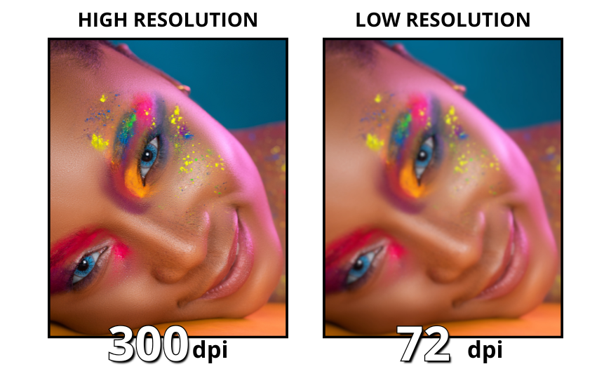
For design elements like logos, icons, and graphic shapes, use vector files whenever possible. Vector graphics are scalable without any loss of quality, which means they look just as sharp at full page size as they do at a quarter inch. If vector files are not available, apply the same 300 DPI standard to any raster graphics you use.
Step 7: Export Your Print-Ready Files
Exporting your file correctly is the last step between your design and your finished book. Getting it wrong at this stage can delay your order or result in a print that does not match your design. Check for these things before you export to ensure everything looks good and will turn out the way you imagined.
Pages should be in consecutive order as single pages, not spreads. PrintingCenterUSA handles page imposition during production, so your job is to upload a clean, ordered single-page PDF.
All images should be at 300 DPI and embedded in the file rather than linked. Linked images that live on your hard drive will not travel with your PDF and can result in missing images in your final file.
Fonts should be embedded or outlined. If your fonts are not embedded, they may substitute on our end and change the appearance of your text.
Bleeds should extend 0.125 inches beyond the trim line on all sides where content bleeds off the page.
Margins should be confirmed before export. Run through your pages and make sure nothing critical is sitting too close to the trim line or the binding edge.
Export as a PDF and use our free file review before placing your order. Our team will check your file for any issues before it goes to press so you are not discovering problems after your order is in production.
Book Design Export Checklist
Pages in consecutive order as single pages
All images at 300 DPI minimum
Bleeds set to 0.125 inches
Binding margins confirmed
Fonts embedded or outlined
File exported as print-ready PDF
Free file review before ordering
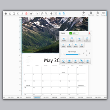
Designing Your Book in Canva
Canva has become one of the most popular tools for designing books, especially for first-time authors and small business owners who want professional results without a steep learning curve. It is beginner-friendly, browser-based, and produces print-ready PDFs when exported correctly.
To design a book in Canva, set your document dimensions to match your chosen book size before you start adding content. Canva will let you set custom dimensions so you can work in the exact trim size of your book. Design each page individually in the correct consecutive order and keep your margins and bleeds in mind as you go.
Many of our customers design their books in Canva because it is one of the easiest tools for creating professional designs while still on a budget and being user friendly for beginners. To make printing simple, we found a ready to use book template you can customize in minutes. Just drag and drop your photos, add your copy, and your design is ready for print. Start with the template here: CANVA TEMPLATE LINK.
When your design is complete, make sure you download the file correctly for professional printing. Follow our step-by-step guide here to learn how to export your Canva design for print.
One thing to keep in mind with Canva: it works well for straightforward layouts but has limitations for complex typographic control and advanced print settings. For books with intricate layouts, heavy image work, or precise typography requirements, Adobe InDesign gives you more control. If you are comfortable in Canva and your layout is relatively straightforward, it is a completely legitimate option for producing a professional print-ready book file.
Common Book Design Mistakes to Avoid
Using low-resolution images is the most common mistake and the one that surprises authors the most when they see their proof. Check every image before you finalize your design.
Using too many fonts makes a book feel inconsistent and amateur. Stick to your font rules and resist the temptation to add variety through typefaces. Use weight and size for hierarchy instead.
Ignoring margins is a setup mistake that costs hours of rework. Get your margins right in your template before you design a single page.
Forgetting bleeds is another setup issue that shows up at the worst possible time. If any element in your design is intended to run to the edge of the page, your bleed needs to be set up from the start.
Skipping the proof copy is the most expensive mistake you can make. A proof copy costs a small amount upfront and catches errors that are invisible on screen. Every author who has skipped a proof and regretted it will tell you the same thing: always order the proof.
Not using a template is the easiest one to avoid. PrintingCenterUSA offers free Adobe templates for every binding type and popular size with margins, bleeds, and safety zones already configured. Start with a template and you eliminate most of the technical setup entirely.
Book Design: Key Facts for Reference
Standard book sizes: 5.5 x 8.5, 6 x 9, 8.5 x 11, 8 x 8, 11 x 8.5 landscape
Recommended outside margin for book printing: 0.5 inches
Recommended binding margin for book printing: 0.8 inches
Recommended bleed for book printing: 0.125 inches
Minimum image resolution for for book printing: 200 DPI
Recommended image resolution for book printing: 300 DPI
Recommended body text size for book printing: 10 to 12 pt
Recommended chapter title size for book printing: 24 to 36 pt
Recommended header size for book printing: 16 to 24 pt
Recommended page number size for book printing: 8 pt
Maximum fonts in one project for book printing: 3 to 5 types or weights
File format for upload for book printing: print-ready PDF with single pages in consecutive order
Binding options at PrintingCenterUSA for book printing: saddle stitch, perfect bound, spiral, wire-o
Saddle stitch maximum page count for book printing: 64 pages
Perfect binding minimum page count for book printing: 28 pages
Spiral binding minimum page count for book printing: 8 pages, maximum 2.75 inches thick
Wire-o binding minimum page count for book printing: 8 pages, maximum 1.25 inches thick
Ready to Turn Your Print Projects Into Rewards?
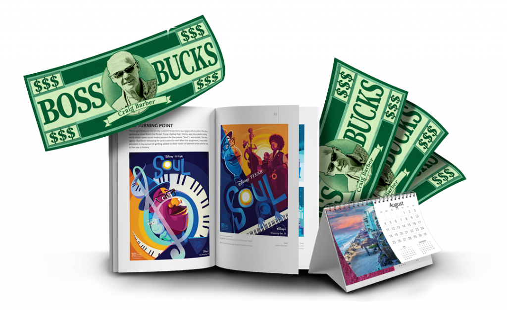
If you’re a creator, author, designer, or growing business, did you know the PCUSA Creator & Partner Network was built for you? Share your work, tell your story, and earn Boss Bucks (print credit) or even cash just for participating! Programs like the Creator Spotlight, Success Stories, Partner Referrals, and the Affiliate Program let you get featured, grow your reach, and earn up to $650 in rewards at no cost to join. It takes just a few minutes. Get started now!
Frequently Asked Questions
What is the best size for a book? The most versatile size for most book projects is 6 x 9, which works well for novels, nonfiction, and business books. For cookbooks and manuals, 8.5 x 11 gives you more room for images and detailed layouts. For children’s books and photo books, 8 x 8 or larger square and landscape formats work best.
What is the standard book margin size? For most books, set outside margins to at least 0.5 inches and binding margins to at least 0.8 inches. For spiral and wire-o binding, set the binding-side margin to 0.875 inches to accommodate the coil.
What resolution should images be for book printing? 300 DPI is the standard for professional print quality. The minimum acceptable resolution is 200 DPI. Web images at 72 DPI are not suitable for print and will appear blurry or pixelated in the finished book.
How many fonts should I use in a book? Limit yourself to three to five font types or weights across the entire project. Using a font family with multiple weights like bold, italic, and regular gives you flexibility without introducing inconsistency.
What file format should I submit for book printing? Submit a print-ready PDF with all pages in consecutive order as single pages, not spreads. Fonts should be embedded or outlined and images should be embedded at 300 DPI with bleeds included where applicable.
Which binding is best for a cookbook? Spiral binding is the most popular choice for cookbooks because pages lay completely flat and rotate 360 degrees, which means the book stays open on the counter hands-free while you cook. Perfect binding is a good option if you want a more formal bookstore-style appearance.
Can I design a book in Canva? Yes. Canva produces print-ready PDFs when exported as a PDF Print file and works well for straightforward book layouts. Set your document dimensions to your book’s trim size, design pages in order, and follow our guide on exporting Canva files for print before uploading.
What is the difference between margins and bleeds? Margins are the safe zone inside your page where all important content should live. Bleeds are the extra 0.125 inches of image or background that extends beyond the trim line to ensure no white edges appear after cutting. Both need to be set up correctly in your template before you start designing.
Free Tools and Resources to Get You Started
Not sure how to get your file print-ready? Use our free online book designer, download a free Adobe template for your book size and binding type, or submit your file for a free file review and our will do an industry standard 43-point inspection for any issues before it goes to press. Order a free sample pack today and explore our paper and binding options! If you would rather focus on your content and leave the design to someone else, our Find a Designer service connects you with professionals who specialize in print-ready book design. Start your book project today!