

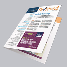


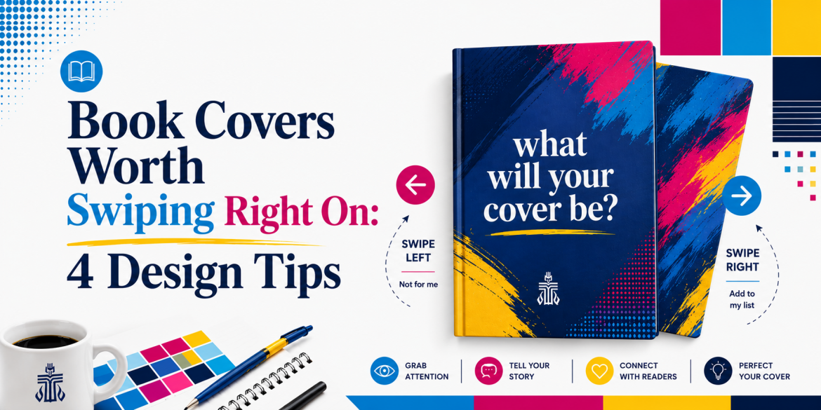
Book Covers Worth Swiping Right On: 4 Design Tips
We all grew up hearing “don’t judge a book by its cover,” but the publishing world said, “Yeah… so anyway,” and well, here we are. The book industry is booming right now and with more books hitting than shelves than ever before, book covers have become a huge part of standing out. We’ve compiled the best 4 design tips for creating eye-catching book covers to make sure your cover is the stand out it needs to be!
Designing a book cover is honestly a lot like the modern dating world. Sometimes it’s a dating app swipe-right situation. Other times it’s spotting someone across the room. Seeing them in your local coffee shop or heck even in the grocery aisle, making eye contact for a few seconds, and immediately trying to figure if you’re interested or pretending to suddenly have a message in your phone. Either way, first impressions are doing a LOT of heavy lifting.
And books? They only get a few seconds to make that impression.
Think about it. You’re scrolling online looking for your next read. You’re browsing aisles in your local bookstore. Hundreds of covers are flying past your face at lightning speed. Your brain is making split-second decisions the entire time.
All before reading a single page. It’s quite frankly, a lot.
That’s the power of a book cover.
Your cover is basically your book’s profile picture, opening line, outfit, personality, and overall vibe wrapped into one tiny rectangle. No pressure.
It tells readers what kind of experience they’re about to commit to before they even read the description. First date with a book kind of vibes.
Good book covers create curiosity. They make someone stop scrolling.
So if you’re currently staring at 37 font options, questioning every life decision, and moving your title around one pixel at a time trying to “see if that helps,” first of all, welcome. Second, you are not alone. At some point, every creator has stare da their cover thinking, “Is this good? Will someone actually pick this up?” So let’s walk through these top design tips together. After all, in a world full of endless scrolling, your cover has just a few seconds to earn the swipe right.

Understanding the Basics of Book Covers
Typography
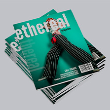
Size does matter….at least in the font world. Eye catching fonts are really what are going to make your book cover stand out the most. Pretend all your readers need glasses. The bigger the font, the more it’s going to stand out in the bookstore aisle, a computer screen as a thumbnail, or better yet, as a tiny image on your e-reader when you’re choosing what book next to download to chip away at your never ending “to be read” list.
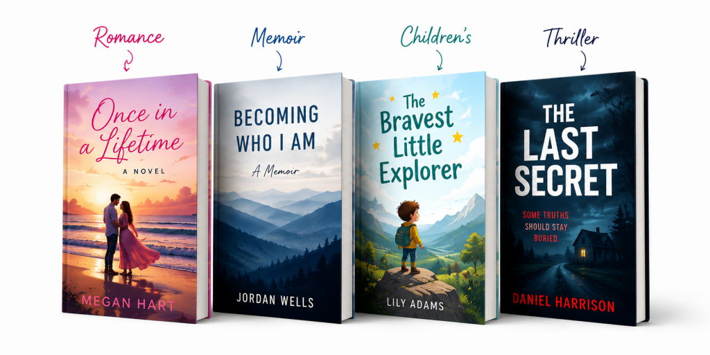
Also, if your title can’t be read easily and it doesn’t match the vibes of the story you are presenting, you’ve already struck out. Your reader should look at your romance novel and feel romance, not slasher vibes.
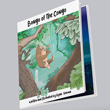
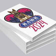
If it’s a children’s book you’ve created, the fonts on your cover should be playful, whimsical, bubbly, look handwritten, and most importantly be easy to read. Pacifico, Fredoka, Quicksand, and Storytime-style fonts instantly feel approachable and creative. They lure the right type of reader into a fun story.
Now on the complete opposite end of the spectrum… thrillers. Thriller fonts should feel anxious, sharp, cinematic, urgent, and slightly unsettling. They should make your reader feel stressed before chapter one even begins. Futura, Helvetica Neue, League Gothic, and Roboto Condensed are all fonts that work perfectly because they advertise the suspense before anything scary can even happen, if at all.
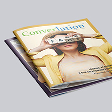
If your book is a romance novel or even a memoir, it deserves to elicit emotion right away. Montserrat, Poppins, Bodoni, Cinzel, and even Baskerville are all fonts that add emotional depth to a cover. They help signal to your reader that they’re about to experience something meaningful and worth investing time in.
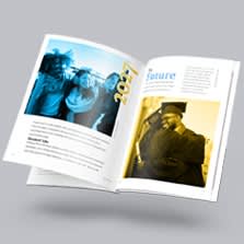
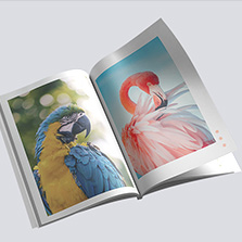
Imagery
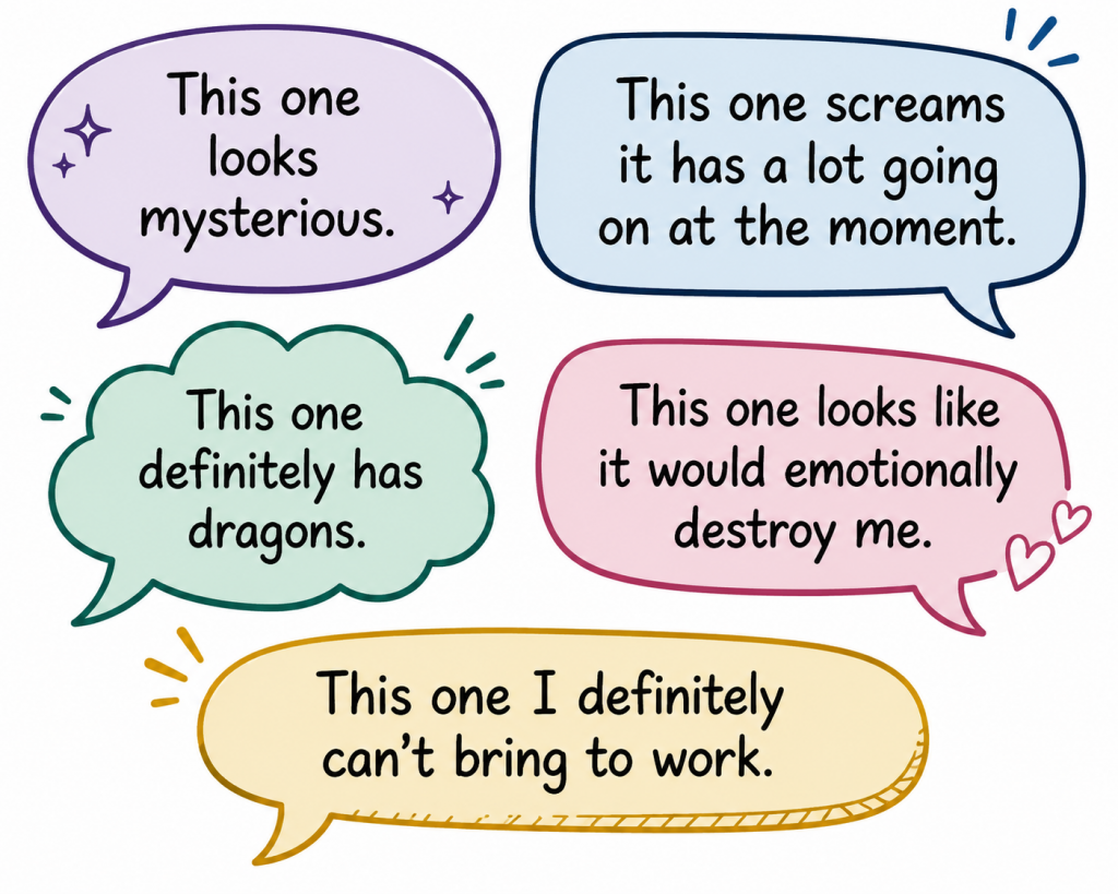
With the images you choose, you can give readers a tiny glimpse into your story… or basically give the plot away without saying a word. Kind of like dating profiles honestly. If someone’s whole profile tells you their whole story before you’ve even said hello, where’s the fun or mystery in that? Book covers work in the same exact way. The real question is: how much or how little do you want to reveal?
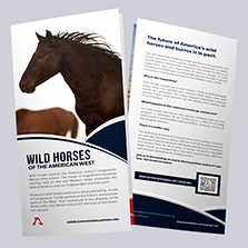
Does your children’s book/fantasy novel need to be covered in dragons and fairies everywhere? Or would one mysterious landscape actually say more? Does your romance novel need the main characters front and center, or would subtle clues feel more personal? Maybe it’s the café they always meet at. Maybe it’s the skyline that quietly means everything by the final chapter. Maybe it’s the bumblebee tight that she can’t live without.
And thrillers? The shadows, harsh colors, empty hallways, or even just the feeling the cover gives off those hints something terrible is waiting inside. The tiniest details can really work well for thrillers. Sometimes the scariest covers are the ones that make your stomach feel weird without you knowing why.
Cover Finishes
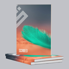
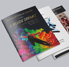
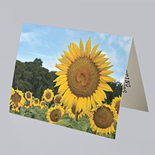
When it comes to cover finishes, children’s books are where glossy covers can REALLY shine. High-color children’s books tend to pop beautifully with gloss paper types or cover finishes like gloss lamination because it helps colors feel brighter, richer, and more energetic, especially with illustrations and vibrant artwork.
And honestly? Matte paper covers work so well for thrillers. There’s just something about a matte finish that makes darker covers feel moodier, grittier, and more cinematic. It gives that “something bad is definitely about to happen here” energy in the best way possible.
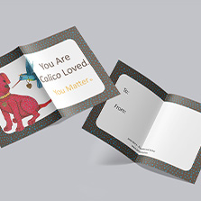
Romance books and memoirs are where soft touch lamination can absolutely elevate a cover. Memoirs and romance novels especially feel incredible with that velvety finish because it instantly creates a softer, more intimate feel the second someone picks up the book. It wants to be held.
Author Name
And lastly, let’s not forget that your author name placement matters more than people think. You wrote the book. You survived the brainstorming, rewrites, trash cans full of wadded drafts, and the “maybe I should delete this entire chapter” moments and somehow turned an idea into an actual story people can hold in their hands. Your name should feel like part of the cover, while still letting the main title shine.
The Fine Print Behind a Book Cover’s First Impression
But here’s where the actual print side of things starts getting real. No matter how perfect your imagery is for your cover, low-quality images can quickly ruin the vibe, kind of like showing up to a first date in gym shorts when everyone else understood the dress code. For print, 300 DPI or higher is your best friend because it keeps your cover looking crisp and professional instead of blurry or pixelated. Additionally, as print uses CMYK color mode, not RGB like your phone or computer screen, designing in CMYK from the beginning can help avoid those unexpected “wait… why does this look different?” moments later.
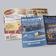
Your cover must work both online and in print. That means things like color, bleed, image placement, and even spine design becomes incredibly important. The binding that you choose can make or break your design because every binding style changes the way your book feels in someone’s hands. Are you going saddle stitch or are you going perfect bound? Which binding will you choose?
Saddle Stitched option for Book Covers
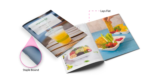
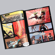
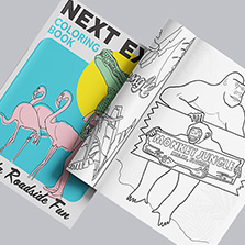
Saddle stitch books have that classic booklet or magazine-style feel and lay flatter when opened, which works beautifully for shorter books, children’s books, and photo-heavy designs.
Perfect Bound option for Book Covers
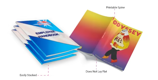
Perfect bound books instantly give more of that polished “main character energy” look with a printable spine that displays your title and author name while sitting on a shelf.
If you’ve chosen perfect bound for your book, you have to make sure you leave enough bleed and safe space around your edges and spine area. You don’t want important text, faces if you’ve got them, or details getting trimmed too close or disappearing into the gutter near the binding. And as mentioned, please… do not forget about the spine. Your spine is sometimes all a reader sees sitting on a shelf. It’s kind of like making eye contact with someone from across the room before the actual introduction happens, it’s the first thing people notice. Any text on the spine should still be readable and visually connected to the front cover design so the entire book feels cohesive from every angle.
In conclusion:
At the end of the day, the combination of all these design tips will help create an eye-catching cover. A great cover will make someone stop scrolling, pause in the bookstore aisle, or stare at their e-reader for an extra second and think:
“Okay… what’s this story about?”
So do just that, make them stop scrolling. Halt them in the aisle. And between you and me, make them curious enough to want a second look. Because the right book covers dont just sell a book. They invite someone into your world.
Recap:
- 1. Font Recommendations by Genre
- -**Romance**: elegant, emotional, soft
- – **Thriller**: sharp, tense, cinematic
- – **Children’s Books**: playful, bubbly, easy to read
- – **Memoirs**: personal, timeless, emotional
- 2. Cover Finish Cheat Sheet
- – **Gloss Lamination**: bright, colorful, energetic covers
- – **Matte Finish**: moody, dramatic, cinematic feel
- – **Soft Touch Lamination**: velvety, luxurious, emotional feel
- 3. Choosing Your Binding Style
- Saddle Stitch
- -Lays flatter
- -Great for shorter books
- -Works well for children’s books and photo-heavy designs
- Perfect Bound
- – Professional bookstore feel
- – Printable spine
- – Better for thicker books
- – Gives immediate “main character energy”
- 4. Before You Send Your Book to Print
- – Use 300 DPI images
- – Design in CMYK color mode
- – Leave proper bleed space
- – Keep important text inside the safe area
- – Double-check your spine design
- – Make sure your title is readable as a thumbnail
So… Ready to Make It Print Official?
At PrintingCenterUSA, we’re here to make this whole process feel a lot more doable and a lot less overwhelming. Think of us as the “extra hand” you need in the office. After 54 years, we’ve seen a lot of book covers, the good, the great, and the “maybe Open Sans wasn’t the one” moments. With our free online design tool and our ready-to-go design templates, you can design your book cover and your book with no extra costs. If Canva is your solid go-to, you can even connect your project and we’ll show you how! And if you still need that extra help, we’ve compiled a list of trusted graphic designers we can point you to, designers that are well versed in the PCUSA world and can help you every step of the way! We’re here to help you make this happen!
We also have a few extras that you didn’t even ask for!
- Not sure if your file is ready? We have you covered there too! Our site offers free file reviews to make sure everything is set before it goes to print.
- Still debating on the right paper for your book cover or book in general? Fill out the form for a free sample packet so you can experience the many papers we have and feel that quality firsthand, even those cover finishes that will make your cover the standout! We’ll even give you $25 in print credit just for asking for one! We care about your project that much!
- Need more of a step-by-step guide? Our Book Guide has even more tips, inspiration, and step-by-step support to bring your vision to life. And get this, you’ll get 15% off an order up to $250 when you download your first guide in your account!
Whether you’re planning to sell your book, share your story for the office or a corporate event, or create something meaningful for friends and family, PrintingCenterUSA is here to help turn your book from a rough draft into its final glow-up. Because just like dating, first impressions matter… and when the right cover catches your eye, it’s hard not to want to know more about the story.
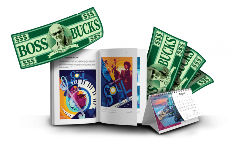
Ready to Turn Your Print Projects Into Rewards?
If you’re a creator, author, designer, or growing business, did you know the PCUSA Creator & Partner Network was built for you? Share your work, tell your story, and earn Boss Bucks (print credit) or even cash just for participating! Programs like the Creator Spotlight, Success Stories, Partner Referrals, and the Affiliate Program let you get featured, grow your reach, and earn up to $650 in rewards at no cost to join. It takes just a few minutes. Get started now!