


Design that Speaks: Translating Feelings into Visuals for Effective Marketing
Welcome to the realm of design where visuals don’t just exist, they speak.
In a world overwhelmed by visual content, it’s crucial to create print marketing materials that not only capture attention, but also convey your message effectively. The difference between your advertisement being overlooked or making a lasting impression lies in its design. ‘Design that Speaks’ delves into the alchemy of blending art with science to craft compelling visual communication, elaborates on thoughtful design and intention, and digs into the science of visual perception. We’ll also explore five key tips that illuminate the path to designing print materials that resonate deeply with your audience.

Thoughtful Design & Intention
To make a lasting impact, it’s crucial to harness the potential of visual communication through thoughtful design. The best designs are seldom the result of random strokes of inspiration or sheer luck. Rather, they are born out of intention, careful planning, and a deep understanding of the message that needs to be conveyed.
Crafting a powerful design begins with understanding its purpose, where it will be used, who it’s meant for, and the outcome you want to achieve. It’s like piecing together a puzzle, where each element has a significant role to play. To start the puzzle, I start with the 5Ws + H framework.
First, we need to know ‘Who’ – the audience. Who will be looking at this book, magazine or catalog? Then comes the ‘What’ – the purpose of our design. What message do we want to convey? What story do we want to tell? What feeling do we want to invoke?
The ‘Where’ refers to where the design will be showcased, both digitally and in print. This could influence the choice of colors, fonts, and images based on the platform’s constraints or opportunities. ‘When’ talks about the right time or context for the design – understanding seasonal trends or cultural events can give our design an added edge.
Lastly, ‘Why’ and ‘How’ asks us to think about our design’s ultimate goal. Do we want to make our audience feel a certain way or prompt them to take a particular action? And how do we accomplish that? Answering these questions not only provides a clear direction for our journey but also ensures our design hits the mark with our audience and accomplishes its mission.
So, whether it’s an advertisement, a brochure, or a book, remember that thoughtful intention is the key to making a lasting impact. By understanding your audience and carefully crafting every element of your design, you can create visual communication that speaks volumes. This is the magic of design that speaks – it is more than just visually appealing, it is a dialogue that engages, inspires, and leaves a lasting impression.
The Science
Did you know that it takes three seconds or less to stimulate the brain simply by what we see with our eyes?
The fascinating interplay between brain activity, visual stimuli, and emotional responses lies at the core of crafting effective visual communication in print marketing. This is a realm where the worlds of science and art intertwine. On one hand, we have the brain – an intricate machine that processes stimuli in fractions of a second. The eyes, our windows to the world, feed it a constant stream of images, colors, and shapes. These visual elements act as keys, unlocking various compartments within the brain, each associated with different emotions and memories.
A masterful blend of images, colors, words, shapes, space, form, and value can act as a potent conductor, tapping into the symphony of the brain’s complex operations. These elements work harmoniously to elicit powerful emotional responses. Emotions, in turn, are potent energies that significantly influence how we perceive and remember information. Therefore, when a marketing material succeeds in evoking a particular emotion – happiness, curiosity, awe – it is not merely identified by the brain but also preserved as a memorable experience.
Humans are innately visual creatures, driven by what they see. By leveraging this understanding, you can ensure your marketing materials leave a lasting impression, standing out amidst the competition. The impact extends beyond mere recognition, triggering emotional connections that can ultimately steer consumer behavior and drive sales. This is the power and potential of design that truly speaks, rooted in the fascinating science of the brain, eyes, and emotions.
Keep reading this article for 5 Quick Tips to Enhance the Visual Appeal of Your Advertisements
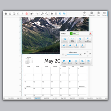
No design program? No problem!
Design like a Pro, without the “Pro”
We have FREE online design software to help you create your products quickly and easily. If you have a computer, you have everything you need to design your project. Now you can design your own booklet, book, catalog, magazine, calendar, brochure, postcards and more in minutes. No subscription required, our design software is free to use anytime for multiple projects. Easily create a free account and store all your designs until you’re ready to print.
We also have FREE downloadable templates for Adobe InDesign, Photoshop, Illustrator, and Acrobat. Our print file templates already contain the correct file parameters such as size, bleed, safety, trim and color profiles. Download, customize, and impress with professional designs in minutes. Simplify your workflow and unleash your creativity today.
5 Quick Tips to Enhance the Visual Appeal of Your Advertisements:
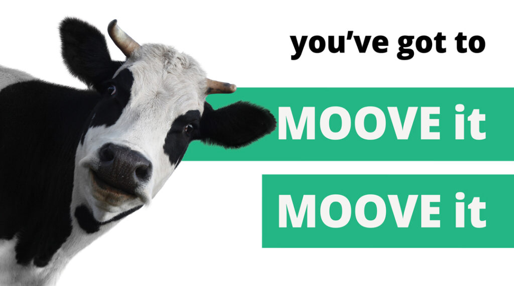
1. Simplicity Is Key
Keeping your entire message simple is the most important thing when creating an effective advertisement. Don’t overdo it with lengthy and overly wordy sentences. You want your copy to be short, clean, and to the point. Don’t confuse your audience with too much information or competing elements.
2. Use Effective Headlines
Headlines are often one of the first things people will see in an advertisement. Therefore, you want to not only use headlines to garner interest, but also utilize the rules of typography to ensure your headline is attractive and pulls in the eye immediately. Never underestimate the power of a good headline.
3. Don’t Be Afraid of Negative Space
White or color space is your friend! Don’t clutter it up—the more you add, the less appealing it becomes to the eye. Advertisements that are too busy will instantly lose interest from the viewer.
4. Be YOU-nique!
One of the most crucial parts of creating an effective advertisement is standing out from the crowd. It is essential to find a unique and creative angle and run with it.


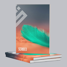
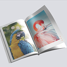
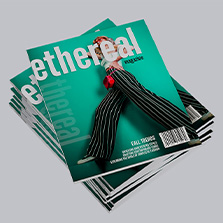
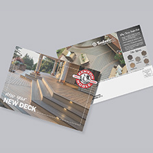
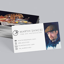
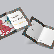
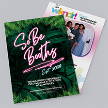
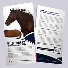
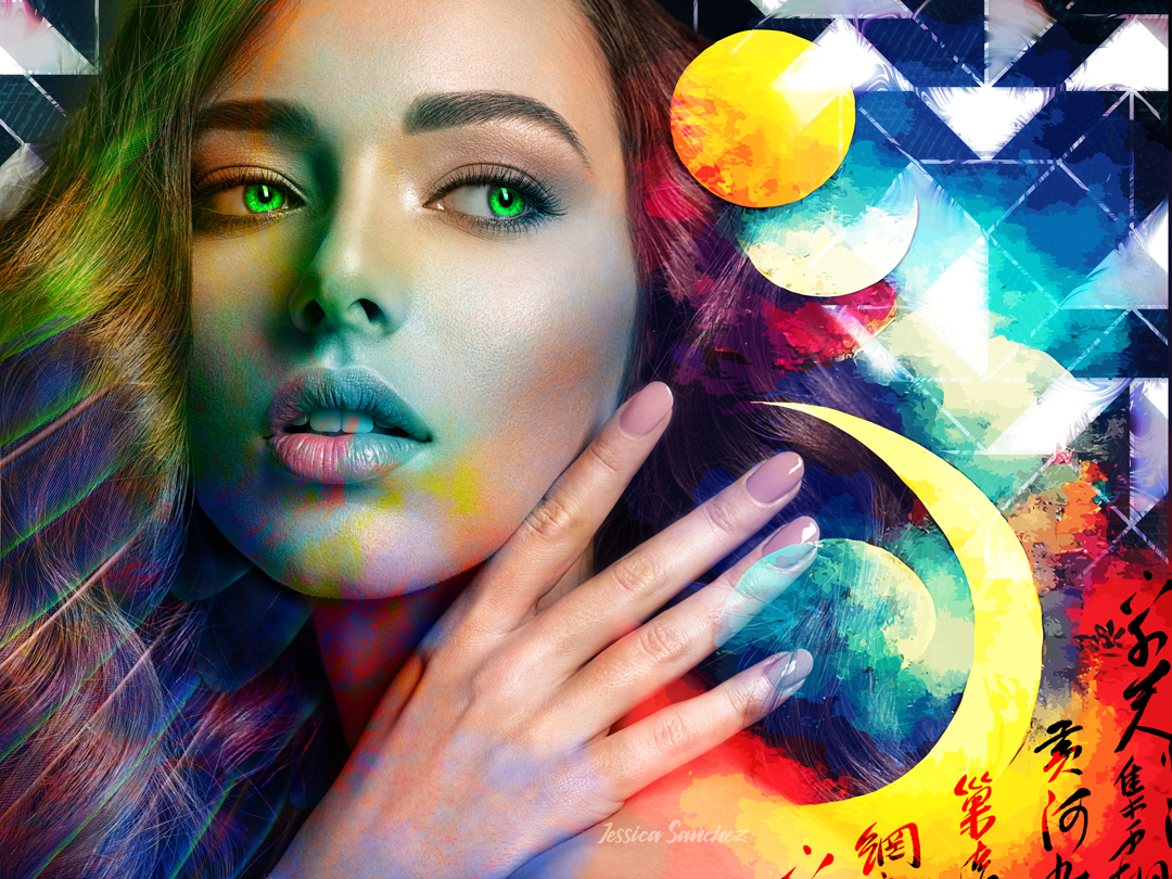
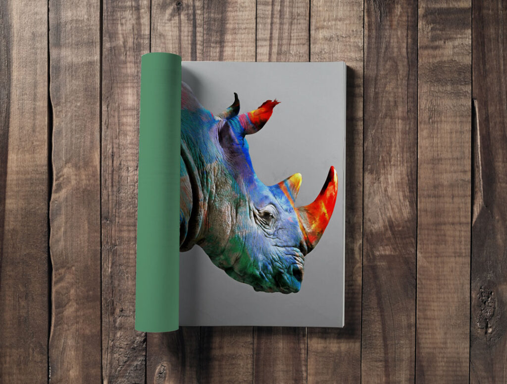
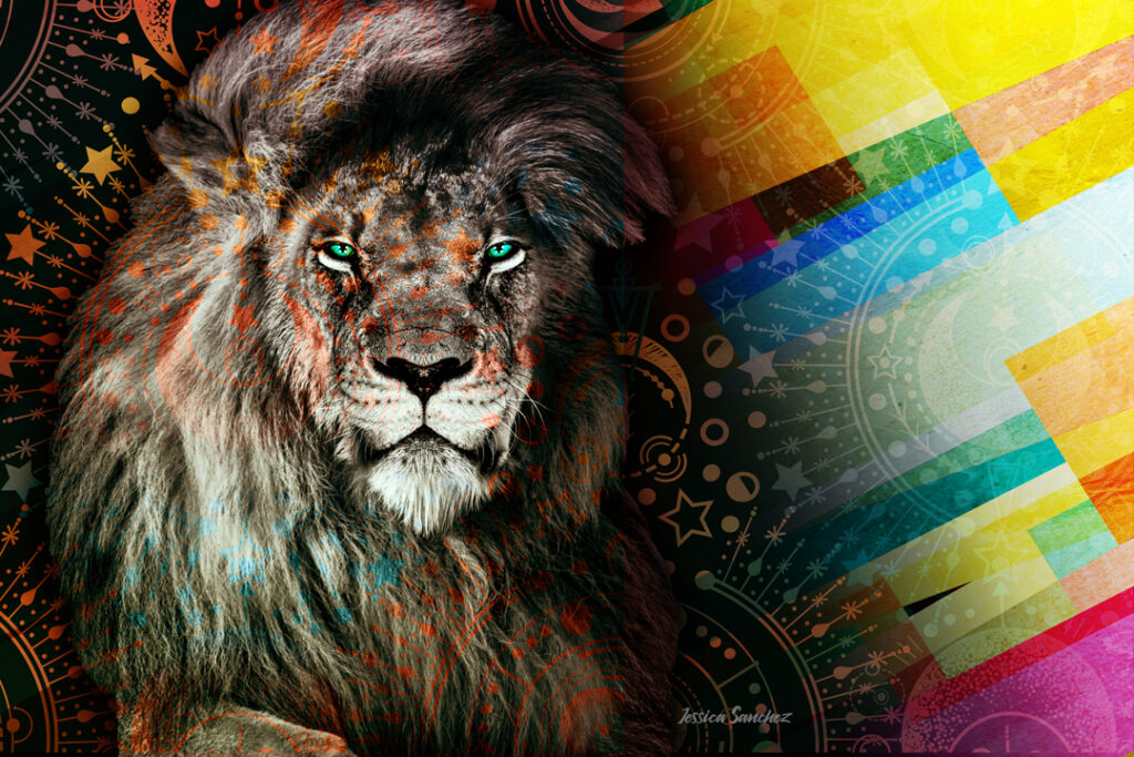
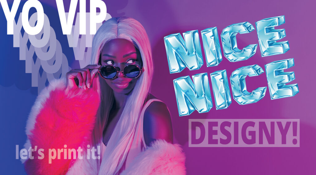
5. Choose Your Images Wisely
During the creation process, you’ll want to take time to choose your images carefully.
Find the image that helps represent the exact feeling you want to create.
You’ll know it when you see it.
Visually creating the desired “feeling” is a powerful strategy in print marketing
By visually creating the desired “feeling,” you are tapping into the vibrational frequencies that the brain recognizes. The more you can connect with your audience on these levels, the more successful your campaign will be in establishing an emotional connection, creating brand memorability, and building trust.
When you strategically combine colors, imagery, and design elements, you can evoke specific emotions and resonate with your audience on a deeper level. For example, warm and vibrant colors like red and orange can ignite feelings of excitement and energy, while cool tones like blue and green evoke a sense of calmness and trust. By carefully selecting images that reflect the desired emotions and align with your brand’s messaging, you can transport viewers into a world where they can imagine themselves experiencing the benefits of your product or service. Furthermore, the use of thoughtful design elements such as typography, layout, and composition can enhance the overall emotional impact. By visually creating the “feeling,” you tap into the brain’s recognition of vibrational frequencies, making your marketing materials more memorable, relatable, and persuasive. Through this approach, you can establish a strong emotional connection, build trust, and ultimately drive your audience to take action.

Consistency is key to building a strong brand identity
Ensure that your visual communication aligns with your brand’s existing design elements, including color palette, typography, and overall style. Consistent use of these elements across various print marketing materials reinforces brand recognition and helps establish a cohesive and professional image.
Moreover, maintaining this consistency extends beyond mere aesthetics; it contributes significantly to the story your brand tells. Every color, typeface, and design element is a word in the narrative that your brand weaves. This narrative should remain constant across all materials and platforms, encapsulating the essence of your brand. It’s this consistency that helps build trust with your audience, instilling a sense of reliability and familiarity. Ultimately, a strong, consistent visual identity can foster loyalty, driving consumers to choose your brand time and time again.
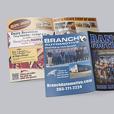
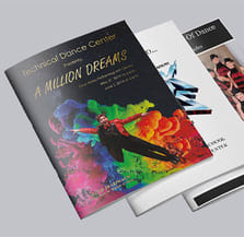
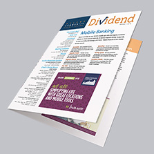
And remember, once you’ve settled on an advertisement and it’s time to release it to your audience, PrintingCenterUSA is here for all your printing needs! With booklets, magazines, brochures, and more, our experts can help you get all the materials you need to relay your message efficiently and effectively.
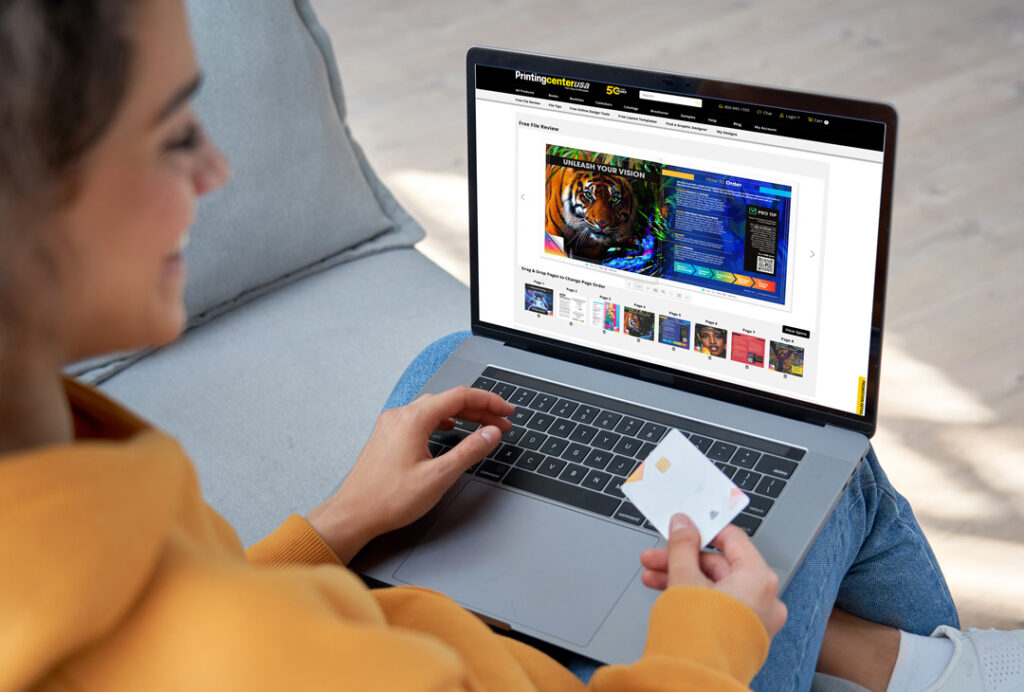
Free File Review
Say goodbye to second-guessing and hello to peace of mind. Simply drag and drop or upload your files and start a Free File Review! You’ll see any details that may need fixed prior to printing, and you can even download and email a free report. With our free file review tool, you can be confident that your files are ready for print. It’s quick, easy, and completely free.