Tag: FAQ File Preparation Body
PrintingCenterUSA provides free downloadable templates on the Brochure Templates Page. These templates include our fold lines.

Brochures, Greeting Cards, Notecards, Flyers, Posters and Newsletters. Select your desired product for more information and free downloadable templates.
Templates and proofs include fold marks that indicate where the fold will be. It is best to line up your panels with the fold marks to ensure that the fold is in the correct spot during production. Click here to view our list of available templates.
We recommend that all transparencies be flattened before file submission. We also ask that you set your fonts to outlines prior to file submission.
Transparency on PDF documents can sometimes change during processing. If your document has transparencies, please take extra care during the proofing process to review the content in your proof. If your document has font issues, the prepress department will contact you directly.

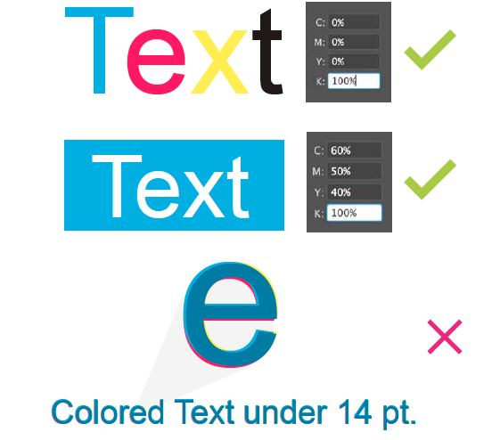
Minute misalignment can cause the 4 separate CMYK inks to not line up perfectly in small text (14pt or smaller), as well as in white text on a colored or black background (knock-out text). This misalignment can make small text look blurry. If you need to do this anyway, it is best to keep the colored text one of the true CMYK colors; black is always an excellent choice.
Please refer to our File Saving section for your program for a step-by-step tutorial on how to save your files: InDesign, Illustrator, and Photoshop.
Thin lines (.25 pt or smaller) and small text (smaller than 8 pt) may not print as clearly as desired. There are two solutions to this problem:
- Use larger text and heavier strokes for line art
- Support small text and thin lines with additional color. For example, small black text could be made into a CMYK color build of C: 50% M: 40% Y: 30% K: 100%.
Never use the color “Registration” that is in the Swatches palette. This is 100% of all colors (CMYK) and will not output correctly.