Terminology
Design and Layout
What is addressability?
Addressability is the number of spots per inch. DPI is way to measure addressability.
What is an artifact?
An artifact is an image distortion caused by image compression.
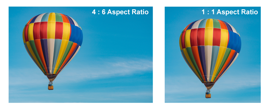
What is an aspect ratio?
Aspect ratio refers to the proportional ratio of width to the height of an image or display that is usually presented in this format: 1:1
What is a bit?
A bit is the smallest unit of data on a computer.
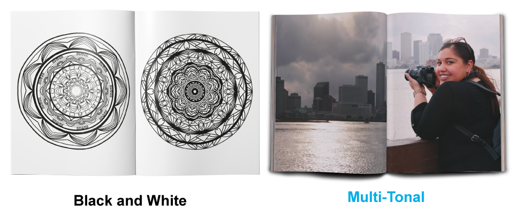
What is black and white?
Black and white are reproductions in one single color, as opposed to multi-tonal reproductions.
What does blowup mean?
Blowup is the upscaling of an image.
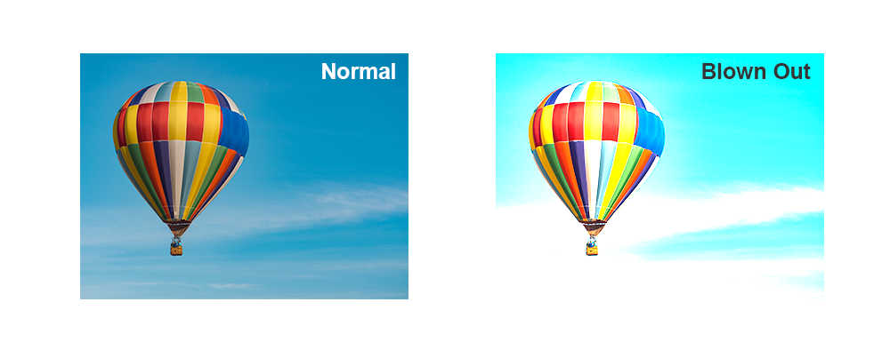
What is blowout?
Blowout refers to when a photographic image is overexposed and has completely lost the detail of the highlights.
What is density?
Density refers to the level of darkness in a photographic image.
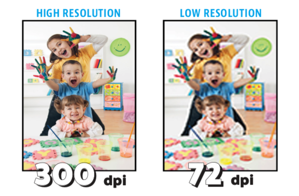
What is DPI?
DPI is the number of individual dots in square inch of a scanned image. PrintingCenterUSA’s recommended DPI is 300.
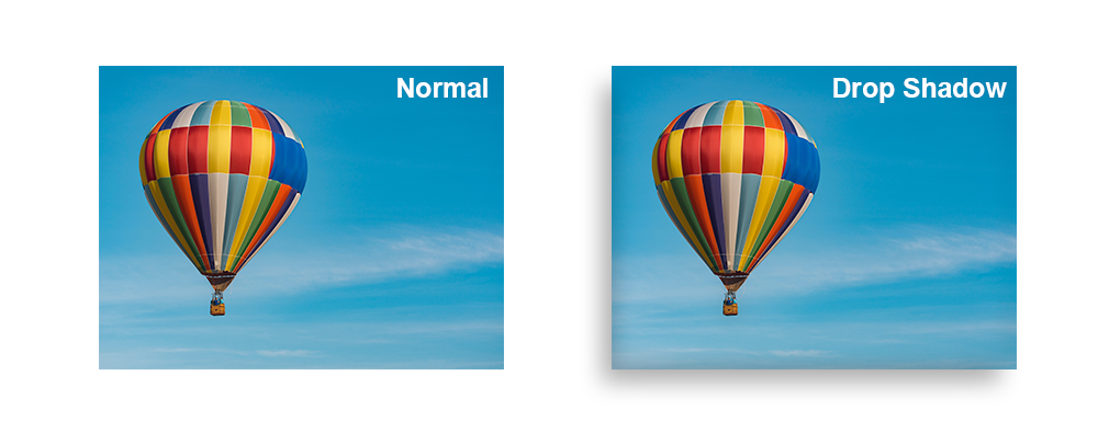
What is a drop shadow?
If you add a drop shadow to an image, then you are adding a digitally produced “shadow” that mimics a natural shadow. Drop shadows are great for adding depth to your design.
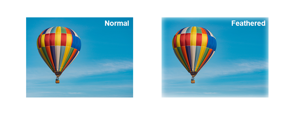
What is feathering?
Feathering, in the design world, refers to the sharpness of an edge of an image or graphic. If you feather an edge, then it will appear to fade out as opposed to being a crisp continuous edge.
What is a flat image?
A flat image is an image with no layers. For example, a JPEG is a flat image unlike a PDF or a native file like a PSD can be saved with editable layers. A flat image is a compressed version of a design.
What is format?
The format refers to all organized information and settings (i.e. text, margins, style, PDF presets, etc.) for a printed product.
What is a grid?
A grid as it pertains to design and layout is a design system implemented by the designer for maintaining consistency and alignment of text and images. To learn more about setting up your grid using guides, click here.
What is a gutter?
A gutter refers to the inner margin on the spine side of your design for print.
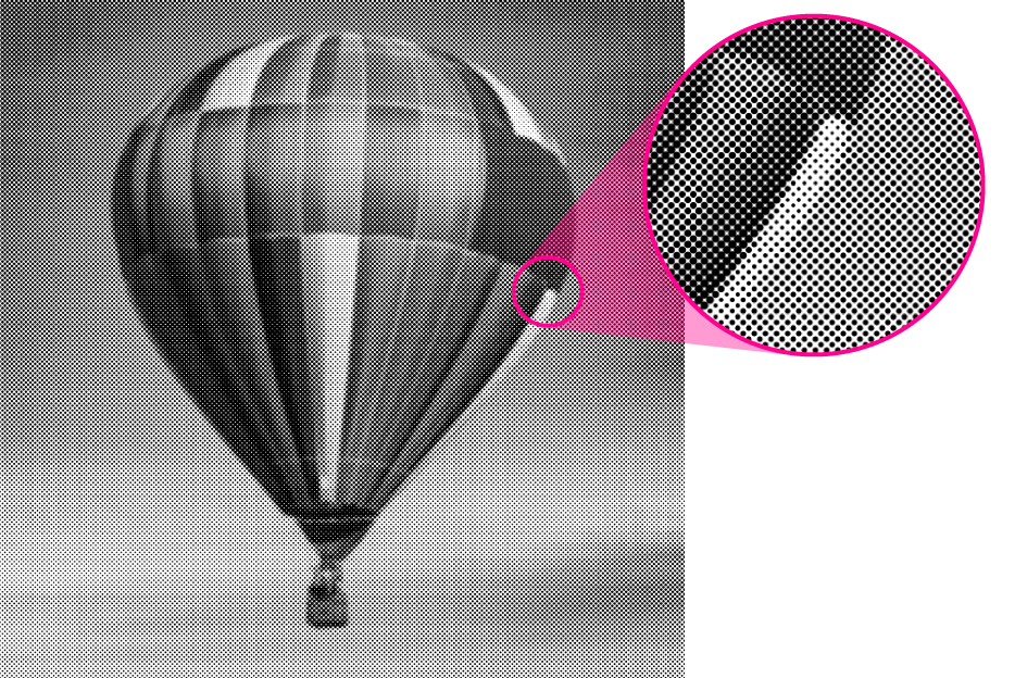
What is halftone?
Halftone refers to a production of an image where the gray tones and color tones are produced by dots of ink varying in size.
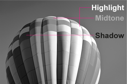
What are highlights?
Highlights are the lightest portion of your photograph.

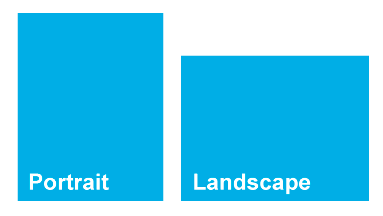
What does landscape mean?
Landscape refers to a horizontal orientation of an image or product.
What is a layout?
Layout refers to the arrangement of elements, such as text, graphics, and images for your printed product.
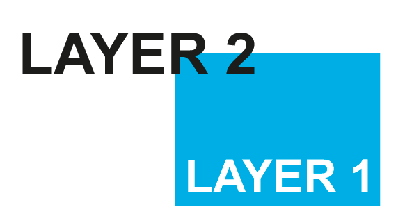
What are layers?
Layers refer to the different levels that you can place individual graphics, text, or images in a design file. Layers make it possible for you to place one design element on top of another.
What is lorem ipsum?
Lorem Ipsum is a commonly used “dummy copy” that mimics Latin and is used as a placeholder for actual copy during the designing process.
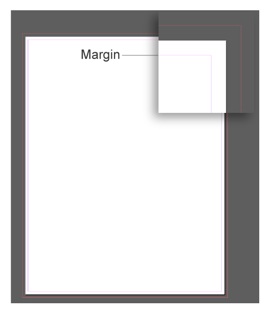
What are margins?
Margins are guidelines a designer will set up and utilize to keep all information within a certain area of the design. To learn more about setting up margins in your design programs, click here.
What are midtones?
Midtones refer to the medium tones within an image—neither light nor dark.
What is a mockup?
A mockup is a digital representation of what a physical printed product will look like after production. For example, when you use our online design tool and click on the preview, you are seeing a mockup.
What is a montage?
A montage is when several photographs are displayed together forming a composite illustration.
What is negative space?
Negative space refers to the areas around or between the main focus of a design.
What is opacity?
Opacity is the level of transparency.
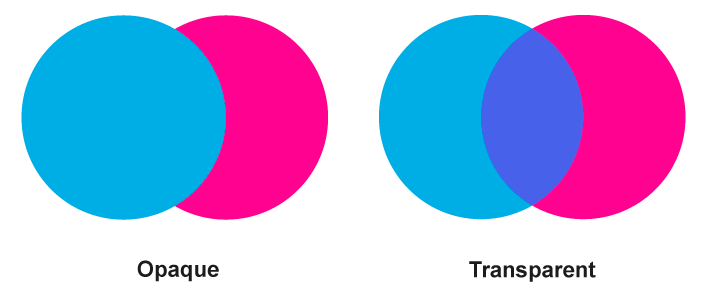
What does opaque mean?
Opaque is when the transparency is at 100%, meaning there will be no show-through.
What is pagination?
Pagination is the sequence of numbered pages.
What is a pixel?
Pixel, short for “Picture Element” is the smallest element in in an image that can be represented on a screen. It is the digital version of a dot
What is pixelization
Pixelization is when a digital image is enlarged beyond its maximum file size, creating an image that no longer has a smooth blending of detail but visible squares or pixels. You want to avoid pixelization at all cost.
What does portrait mean?
Portrait refers to a vertical orientation of an image or product.
What does PPI mean?
PPI is the number of individual pixel density of an electronic image. PrintingCenterUSA’s recommended PPI is 300.
What does resample mean?
Resampling is resizing an image specifically by increasing or decreasing the number of pixels.
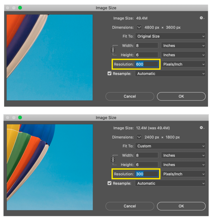
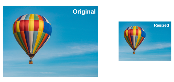
What does resize mean?
To resize an image, document, or graphic element means to make the size smaller or larger.
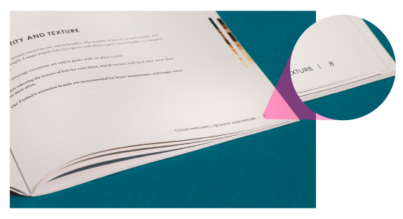
What is resolution?
Resolution refers to the level of detail within a digital image. The higher the resolution, the more fine detail in the image. When going to print, it is best to have a resolution of 300 so all text and images will be clear.
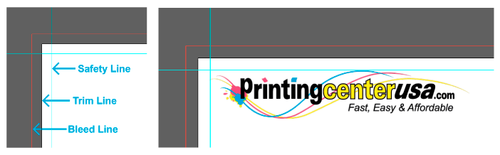
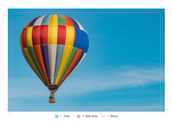
What is the safe zone?
Cutting of your printing piece is done in large stacks and may vary from the top and the bottom of the stack. The safe area is the area of your design that is safest to place all important information such as logos or page numbers that must not get cut off.
What does scaling mean?
Scaling in the design world refers to the growing or shrinking of an image or text while maintaining the original proportions. The opposite of this would be to skew an image or text, which will make your design elements appear stretched or squished. The way to ensure you are scaling instead of skewing is to hold down SHIFT while you are changing the size of your design elements.
What is stock photography?
Stock photography refers to a library of professional photographs of common places, themes, people, etc. that can be purchased and/or licensed for specific use. For a list of Stock Photography websites,
click here.
What is a vector?
Vectors are graphics that are formed by connected lines, anchor points, and curves to create a solid shape. Each of these elements has a definite position in relation to one another and can be scaled without causing pixilation. Vector files are saved as SVG, EPS, PDF, or .AI and are unlike JPEG, PNG, GIF, etc.
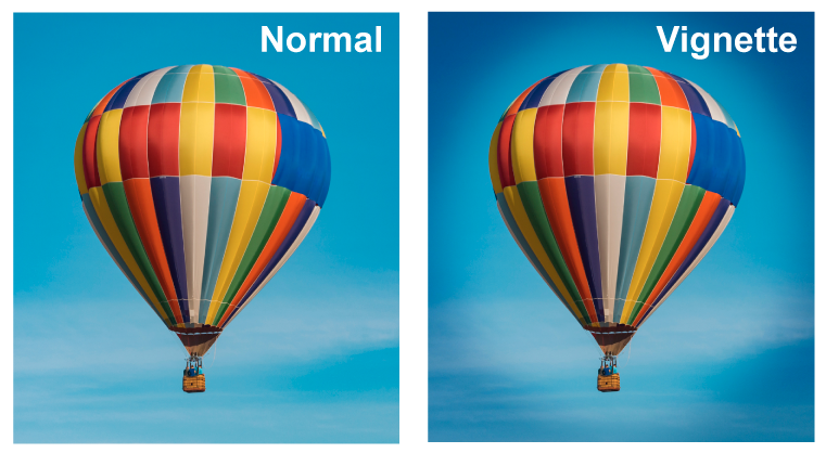
What is a vignette?
A vignette refers the softening or fading darker of the edges of an image.
Print
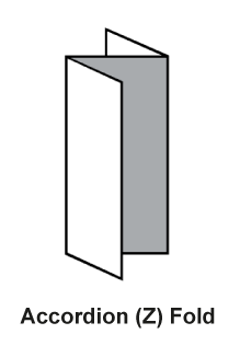
What is an accordion fold?
An accordion fold is a folded product, like a brochure, that is folded in a zig-zag pattern that creates a product that each page flow into the next.
What does backing up mean?
Backing up refers to printing on the back side of a sheet that has already been printed on the opposite side.
What is a brochure?
A typical brochure is similar to a flyer, but folded in either a half fold or a tri-fold. You can also have a booklet brochure, which is similar to a saddle stitched booklet.
What is bulk?
Bulk refers to the thickness of paper.
OR Bulk can also refer to print quantities of 500+.
What is caliper?
Caliper is the thickness of paper and is measured in thousandths of an inch.
What is coating?
Coating refers to when paper has been coated by a mixture of materials to create certain paper qualities. Depending on the coating type, coated paper can be harder to write on than uncoated paper.
What is color calibration?
RGB and CMYK can be adjusted to match from monitors to printers within the confines of the color gamut used.
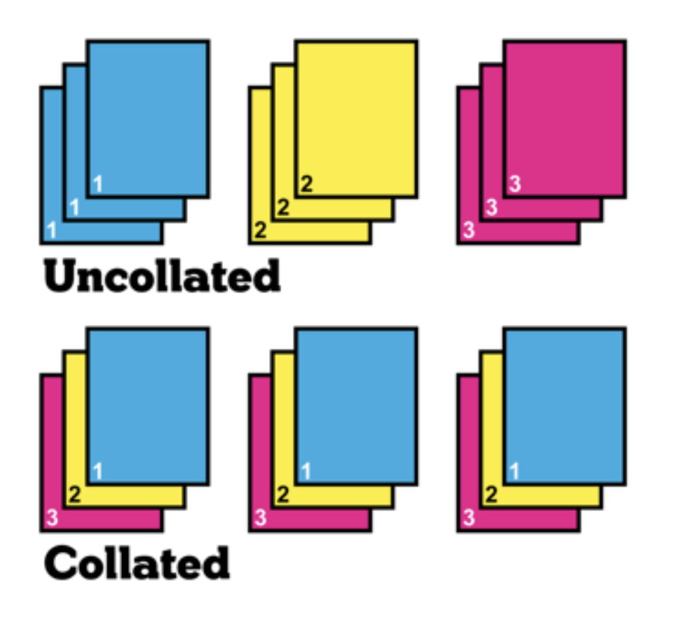
What does collate mean?
Collate means to collect, arrange, and assemble in a specific order of sequence. In printing, it means to assemble multiple sheets or parts together to create a set. It is most commonly used in the preparation of booklets.
What is a crease?
Creasing is a process that prepares the paper for folding by creating two parallel folding points. Creasing makes your product fold evenly, cracks less along the edge of the fold, and provides an overall more professional appearance.
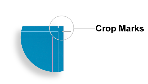
What are crop marks?
Crop marks are small tic marks that are added to a design during the preflighting process and then printed on the outside of printed material to mark the trim line.
What does die cut mean?
Die Cut refers to the process of cutting out a specific shape or design out of a printed product. PrintingCenterUSA does not die cut any products (except for presentation folders).
What is desktop publishing?
Desktop Publishing refers to the production of printed material by having a desktop computer linked to a desktop printer.
What is digital printing?
Digital printing is printing from a digital image onto a variety of substrates with a press that does not use plates and uses toner versus ink.
What is a digital proof?
A digital proof is what is provided to the customer after the files have been prepared for print. The digital proof will highlight the bleed line, trim line, safety line, page order, etc. You must review your digital proof closely and either approve or reject it.
What is dot gain?
Dot gain refers to a natural effect in the printing process that causes printing defect that causes the dots, or the smallest printed unit, of a project to print larger. This causes darker tones and hyper-saturation. It occurs in most printing applications and is compensated for using color curve adjustments.
What is a hard copy proof?
A hard copy proof is provided upon request from the customer at an additional cost. A hardcopy proof is a physical print of your art files from the product. It is mailed to you for approval. A hard copy proof will be the best representation of how your color will appear on the final product.
What does imposition mean?
Imposition is the process of preparing your Print-Ready PDF for print by arranging the pages onto printer’s sheets in a way that makes printing faster and less wasteful.
What is lamination?
Lamination is a process that binds plastic to a sheet of paper by adding heat and pressure.
What is letterpressing?
Letterpressing is a printing technique that involves pressing inked metal type into paper.
What is line copy?
Line copy is a document that consists of purely of black and white without any gray tones.
What is makeready?
Makeready refers to all of the work and materials that go into setting a machine for the printing process.
What is a matte finish?
Paper with a matte finish has a “flat” look to it. It does not shine and reflect light the same way that gloss paper does.
What does mottle / mottling mean?
Mottle refers to a defect in printing which can create a spotty or uneven appearance of a print, primarily in solid color areas.
What is offset printing?
Offset printing is printing on a 4 color lithography press where the pages of your project are imposed onto a plate, then the image is transferred to an intermediate blanket cylinder that prints one of the 4 CMYK colors at a time onto the individual pages of your product.
What is overprinting?
Overprinting refers to the process of printing on a sheet of paper that has already been printed on. These pre-printed sheets are referred to as shells.
What is overrun?
Overrun is when the printer prints extra copies of a product.
What is picking?
Picking is when the ink printed on paper has a greater surface strength than the paper, causing it to lift or curve off or transfer to the sheet it is stacked with.
What is preflighting?
Preflighting is the process used to evaluate all digital components of an art file (usually aPDF) before it is sent to print. The preflighting process will fonts, etc. will all print as expected.
What does print quality mean?
Print quality simply refers to the overall quality of a printed piece. Is the color accurate, is the binding durable, was the trimming accurate?
What are process colors?
Process colors are the colors involved in offset or four-color printing: Cyan, Magenta, Yellow, and Key (Black).
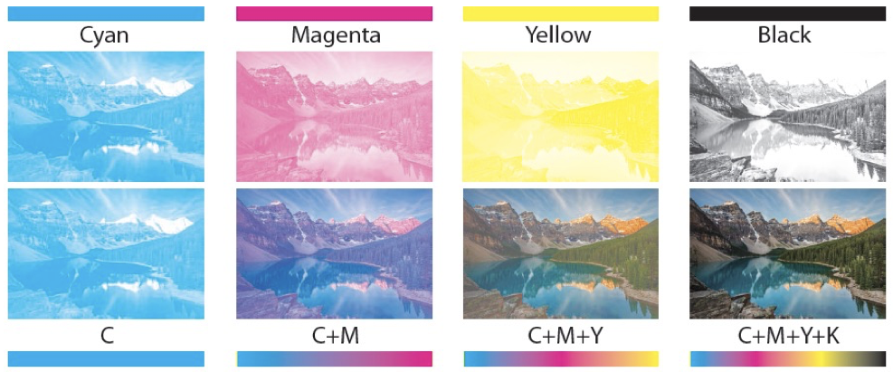
What is process printing?
Process printing is printing that requires multiple layers of halftone plates to produce full color images.
What is the safe zone?
Cutting of your printing piece is done in large stacks and may vary from the top and the bottom of the stack. The safe area or inner margin in which to keep all important elements within to prevent them from trimming off, should be at least 1/8″ inside the edge of the final trim size.
What is self-cover?
Self-Cover (soft cover) is when the cover and the inside paper are the same weight. We recommend 100# Text (Gloss or Matte) for both the inside and cover paper.
What does sheetwise mean?
Sheetwise is printing on both sides of a sheet of paper. The first side is printed with one plate, then the paper is turned over and printed on using another.
What is show-through?
Show-through is when the ink printed on the front of a paper shows through to the back side of the paper. The thicker the paper, the more opacity, the less show-through.
What is a signature?
A signature is a printed sheet of paper after it has been folded.
What is slitting?
Slitting is the cutting of printed sheets into two or more sections with a cutting wheel.
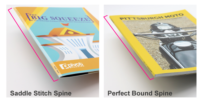
What does spine mean?
The spine is the bound edge of a printed book or booklet.
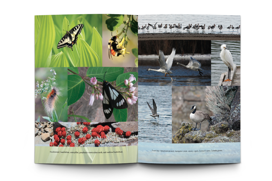
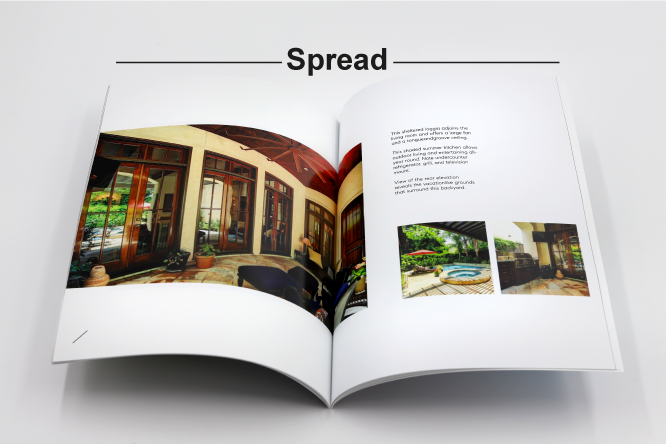
What are spreads?
Spreads refer to a set of adjacent facing pages on the inside of a book or booklet.
What does stock mean?
Stock is the term for paper to be printed on.
What is a substrate?
Substrate is any material that can be printed on including plastic.
What is the trim size?
The final size of the document after the last cut is made.
What is text paper?
Text paper, or book paper, refers to the thinner paper typically used for the inside pages of books and booklets.
What are tolerances?
Tolerances in printing are the acceptable variations in printing parameters such as registration, stock thickness, dot size, etc.
What is toner?
Toner, as opposed to ink, is used in digital printing and is a dry, powdery substance that is fried to the paper during the printing process.
What does with the grain mean?
With the Grain refers to the feeding of paper into a press that aligns the grain direction of the paper to be parallel with the blade for cutting or folding.
What does work and tumble mean?
Work and tumble is to print on one side of a sheet of paper, then turn it over from gripper to back using the same side guide and plate to print the second side.
What does work and turn mean?
To print one side of a sheet of paper, then turn it over from left to right and print the second side using the same gripper and plate but opposite side guide.
What is wove paper?
Wove paper is a type of paper with a uniform, unlined surface and smooth finish.
What is WYSIWYG?
Pronounced “wizzywig,” WYSIWYG means “What you see is what you get.” Meaning that when you receive your proof, what you are seeing is exactly exceptions:
Color: If you are viewing a digital proof, the colors may slightly differ from what is printed. This is due to the color conversion of RGB (computer monitor) to CMYK (print) color. I’s and L’s: Due to the outlining of fonts, your Ls and Is may look bolder than intended. However, they will print normally.
What is an art file?
An Art File refers to the digital file containing your artwork to be printed. PrintingCenterUSA prefers for your art file to be saved as a print-ready PDF.
What is a bit?
A bit is the smallest unit of data on a computer.
What is BMP?
BMP, or bitmap, is an uncompressed raster image format that is made up of pixel grids.
What is a CODEC?
A Codec, or coder-decoder, is a device for encoding or decoding multimedia data.
What is EXIF?
EXIF, or exchangeable image format, is the descriptive data, or metadata, in an image file that details the resolution, date taken, etc.
What is a GIF?
A GIF, or graphics interchange format, is a lossless image format that supports both static and moving images.
What is a JPG / JPEG?
A JPG, or joint photographic experts group, is a commonly used method for lossy compression of digital images.
What does lossy mean?
Lossy is a type of compression that removes data from the original file.
What does lossless mean?
Lossless is a type of compression that maintains all data from the original file.
What is memory / ram?
RAM, or Random Access Memory, is the physical hardware within a computer that temporarily stores data. This data is referred to as “working data.”
What is a PDF?
A PDF, or portable document format, is the best file format for sending your art files for print. PDFs are an electronic image of text and graphics that can be saved using various specifications, such as bleeds or color profiles, making them useful for printing.
What is a PSD?
A PSD is a native (editable) photoshop document. A photoshop document saves your layers and adjustments for you to change later.
What does raster mean?
Raster images or graphics are composed of pixels. A raster image can be scaled down while avoiding pixelization but cannot be scaled up to be larger than its maximum size. A JPG is a common raster image file type.
What is raw format?
Raw format is uncompressed data. This means the file has never been altered, compressed, or manipulated.
What is an SD card?
An SD card is a commonly used memory card typically used with cameras.
What is a TIFF file?
A TIFF is an image format for representing scanned images or other large bitmap files. It is designed to be compatible with most applications.
What is a vector image?
A vector image is an image composed of points and paths to form a polygon that can be scaled to any size. An SVG is a common vector image file type.
Colors
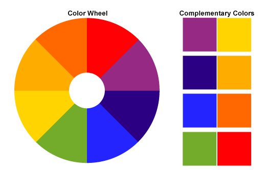
What are complimentary colors?
A complementary color is a color that is on the exact opposite side of the color wheel. When complementary colors are placed next to each other, they appear to “pop.” The sets of standard complementary colors are: Blue-Orange, Red-Green, and Yellow-Purple.
What is color balance?
In printing, color balance refers to the correct combination of the four printing colors (CMYK) necessary to reproduce a photograph or design without a color cast.
What is color correction?
Color Correction is any process used to improve the appearance of color.
What is color separation?
Color Separation in printing refers to the process of separating the color components of an image or file into the four process colors (cyan, magenta, yellow, and black).
What is a gradient?
Gradient refers to a gradual progression from one color to another.

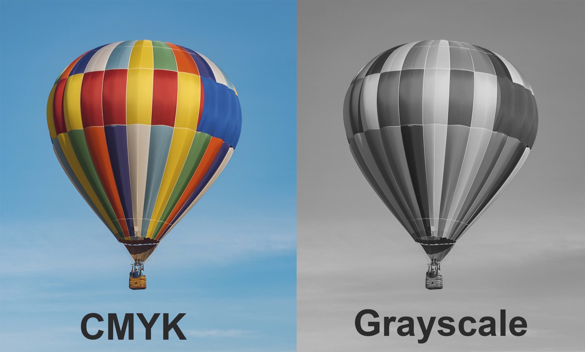
What is grayscale?
Grayscale is an image or file that has been stripped of any color and is displayed in purely gray tones.
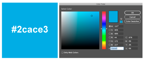
What is a hex code?
A hex code is a way to identify a specific color using hexadecimal values. A hex code will look similar to: #2CACE3
What is a hue?
A hue is a color. White, black and gray are not hues.

What is an ICC profile?
An ICC Profile refers to a set of data characterizing the input or output of color in accordance with standards set by the International Color Consortium.
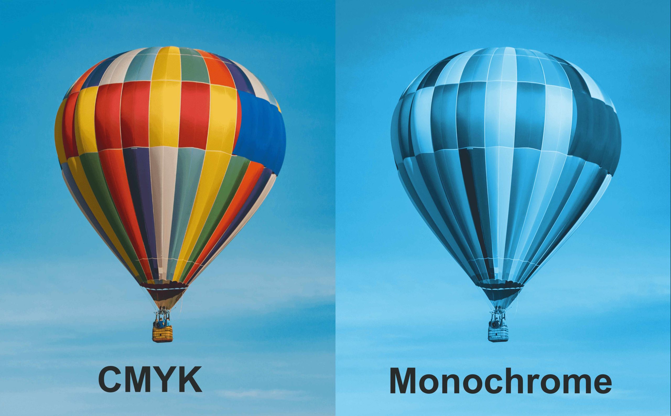
What is monochrome?
Monochrome literally means one color. Similarly to grayscale, monochrome is an image or file that has been stripped of any color except one in various tints and shades.
What is opacity?
Opacity is the level of transparency.

What is a palette?
A palette is a chosen range of colors for a design. For example, if your project revolved around the picture below (left), then you may select your supporting design and graphics to be the color swatches below (right).

What is Pantone?
Pantone is a popular color matching system. The only product PrinitingCenterUSA matches Pantone colors for are envelopes.
What is the PMS (Pantone Matching System)?
The Pantone Matching System is a popular form of color standardization that helps with color matching.
What is saturation?
Saturation refers to the intensity of the color within an image.
What is a shade?
A shade is a color that has been mixed with black.
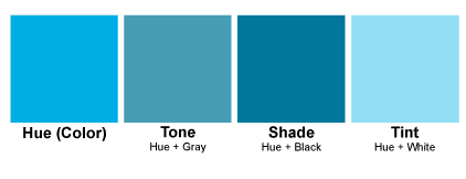
What is a tint?
A tint is a hue or color that has had white added.
What is a tone?
A tone is a color that has been mixed with gray
Typography
What is a bold-face type?
A bold-face type is a thick font weight.
This is an example of a bolded typefaceWhat is a condensed font?
Condensed type refers to a font variation within a font family that makes the width of each letter shorter, therefore giving the font an appearance of being taller or “condensed.”
What is a font?
Fonts are sets of graphic characters with a particular style, kerning, letting, and sizing. Fonts include letters, numbers, punctuation, etc.
What is a font family?
A font family is a set of fonts with similar design qualities but in various weights or treatments to provide distinguishing yet consistent options to a copywriter or typographer. For example, the Arial typeface has options like regular,
regular italic,
bold,
bold italic, and black (which is thicker than bold).
What is a font weight?
Font weight refers to the thickness of a font. Common font weights are thin, regular, and bold.
What are italics?
Italics are a font variation that slants slightly to the right for emphasis.
This is an example of a font in italics.What is lorem ipsum?
Lorem Ipsum is a commonly used “dummy copy” that mimics latin and is used as a placeholder for actual copy during the designing process.
What does lowercase mean?
Lowercase is the version of a letter that is smaller than Uppercase. UPPERCASE, lowercase
What is an orphan?
An orphan is a word or small portion of a sentence that ends up on its own line at the end of a paragraph. It is best to avoid orphans.
What is point size?
Point size refers to the size of your type. For example, your standard point or “pt” for a Word document is 12 pt.
What is a sans serif typeface?
A sans serif typeface is a category of font that is lacking “feet” and is more legible for digital reading.
What is a serif typeface?
A serif typeface is a category of font that has decorative “feet” on the end of each letter. For example, Times New Roman is a serif typeface.
What is a script?
A script is a category of font that mimics a cursive or calligraphy style.
What are small caps?
Small caps are a way to use the styling of capital letters, but at a normal, lowercase letter size.
What is a stroke?
Any line, straight or curved, that forms the shape of a letter.
What is typography?
Typography is the aesthetics of type, fonts, or text. The copy is arranged to be visually pleasing and maximize communication.
What is uppercase?
Uppercase is a capital letter.
THIS IS AN EXAMPLE OF UPPERCASE.
What is a widow?
A widow is a word or small portion of a sentence that ends up being pushed to the next page as the rest of the paragraph.
What are shadows?
Shadows are the darkest parts of an image.